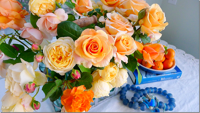
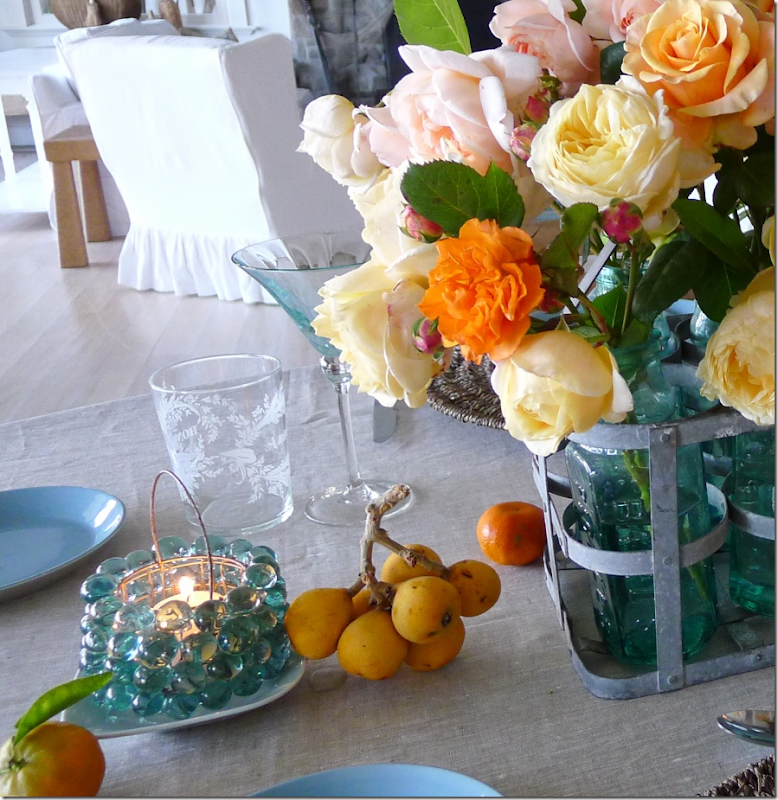
Summer roses at Slim Paley’s beach house.
I was thrilled when one of my favorite bloggers, Slim Paley, sent in pictures of a kitchen redo for the Readers Kitchen series. In case you don’t read her blog, HERE, I suggest you try it out – she leads a glamorous life with her husband and children and her blog is filled with the most gorgeous photographs she takes herself. My favorite pictures are when she shows us a glimpse of her house and garden. She lives near Santa Barbara, but is fortunate enough to also have a nearby beach house and a vacation house in Sun Valley! Each has a completely different look and each is fabulous. Here is how “Slim Paley” describes herself on her blog:
I’m a mother, wife, daughter, sister, friend and ‘work in progress’ striving to Live in the Moment (any minute now
)
I’m also a self taught designer, collage enthusiast and arranger of flowers
blessed to live in Santa Barbara,CA.
I adore books, old book shops and libraries, gardens, food, fashion, photography, art,
architecture, music and virtually anything and everything design related.
Travel, especially far flung and a little adventurous is also a great passion of mine.
Did I mention shoes and handbags?
and martinis?
So, first let’s take a look at the kitchen redo Slim Paley, aka, Carolyn Espley-Miller sent in and then I’ll show some of my favorites of her photographs, taken from her blog. Enjoy!!!
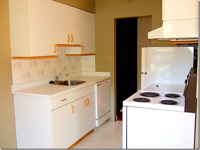
BEFORE: This kitchen is in a trendy section of Vancouver called Kit’s Beach. Slim and her sister redid the apartment and then sold it and then did another one and sold that one too!
As you can see, the apartment had awful golden parquet flooring while the kitchen had a white floor. Instead of replacing the entire floor that was found throughout the one bedroom apartment – Slim matched the wood floor in the kitchen and then restained it all dark brown. I really don’t like these cabinets, and I suppose Slim didn’t either – as she gutted the entire kitchen.
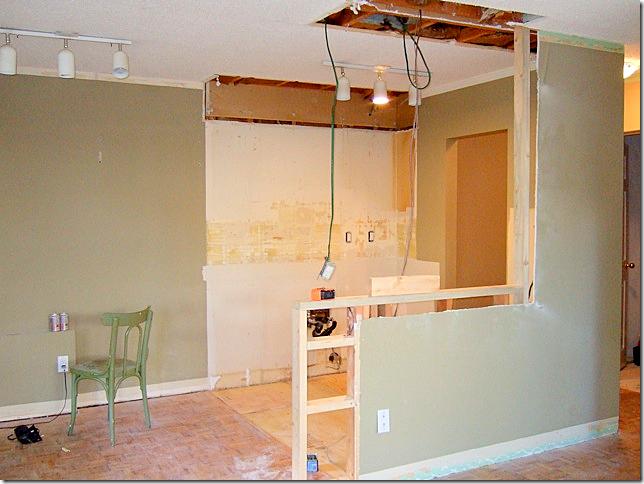
Tearing it all out. The wall between the living area and the kitchen was removed halfway to open up the entire space.
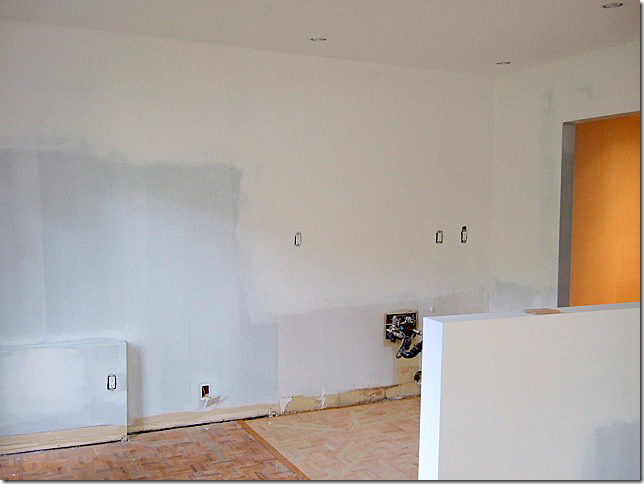
Ah! A nice clean slate to work from. Here the new wood floor has been installed in the kitchen – just waiting for its new stain.
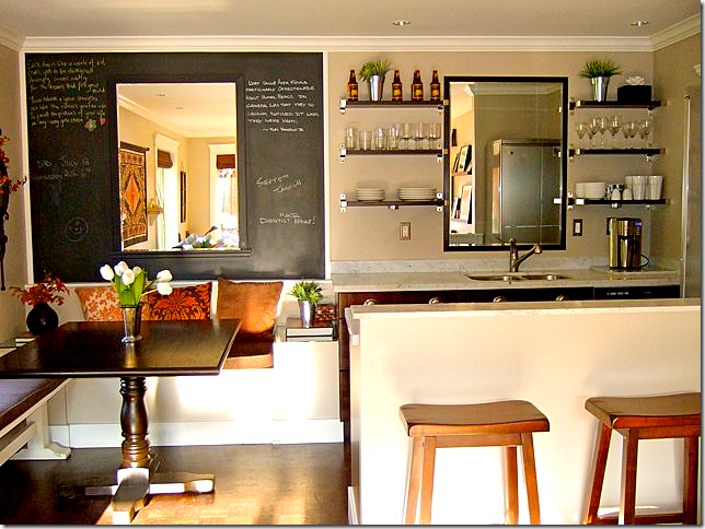
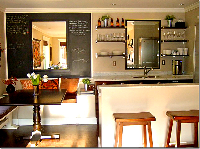
After: Here you can see how open it all is with the wall removed between the kitchen and living area. Behind the newly added banquette is chalkboard paint and a mirror. Such a huge difference!
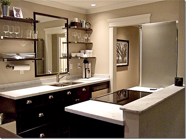
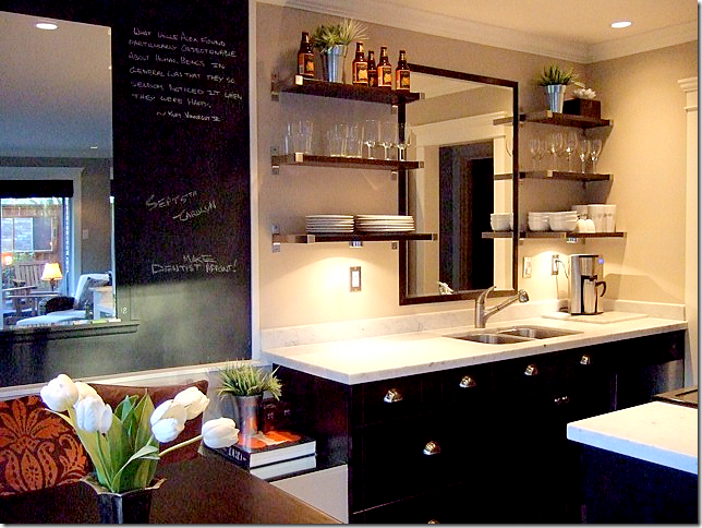
Instead of closed upper cabinets, Slim added open shelving and a mirror, again to open up the space. The black painted cabinets seem more dressy than an all white kitchen. Plus all the black – the cabinets, the chalkboard and the mirror frames relate and become an important design element. The extra hefty door molding makes it seem more important. Everything is, of course, new.
One last view. I happen to love small kitchens – as long as you have a huge pantry too! I think it is so much easier to move around in a smaller space than one where all the appliances are spread out, far away from each other. But, don’t listen to me, I’m a terrible cook and tend to stay far away from any kitchen!!!
Now, here’s a look at some of my favorite photographs taken by Slim Paley for her blog.
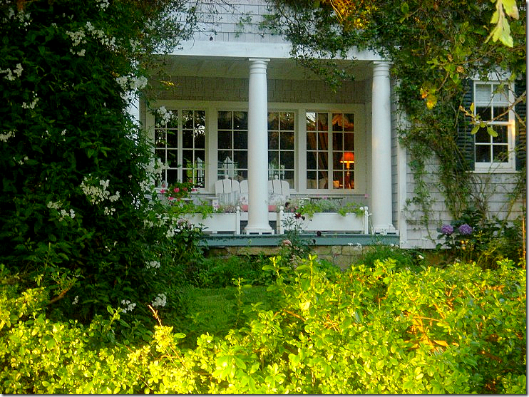
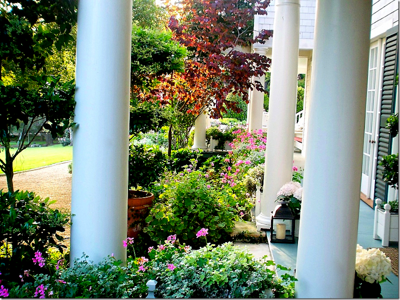
She wrote a beautiful story about porches – showing her own in Santa Barbara.
Her gardens are incredible – the pictures she takes of her flowers are swoon worthy.
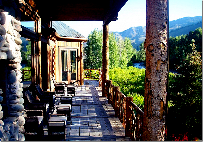
A view of her porch at her Sun Valley house.
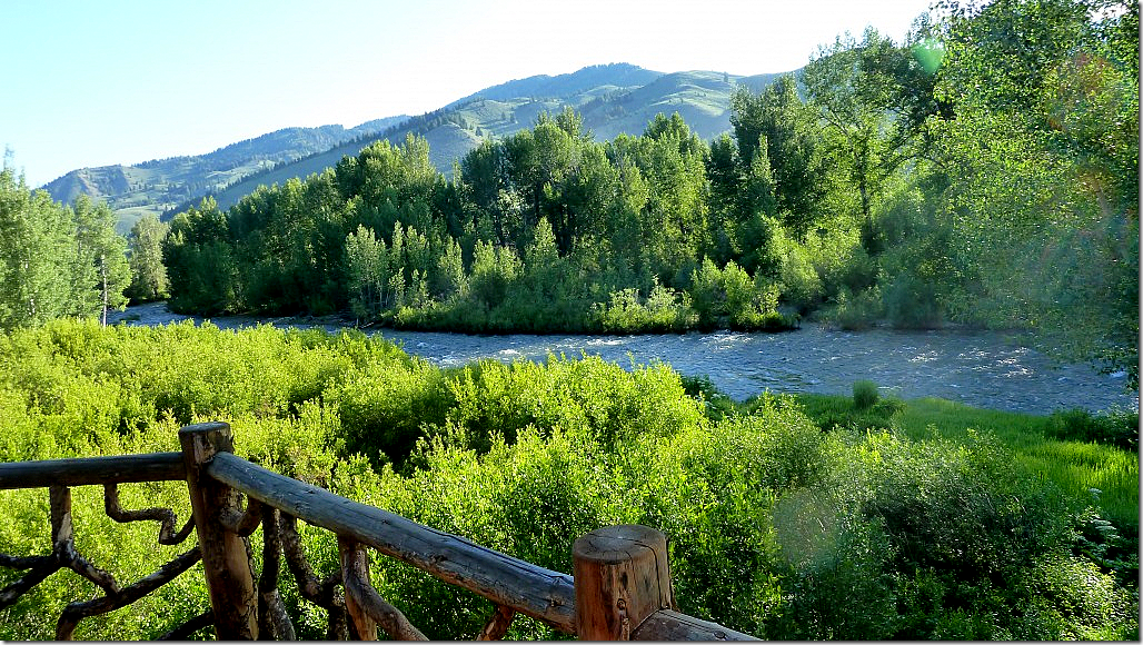
And the view from that porch. Wow. So gorgeous.
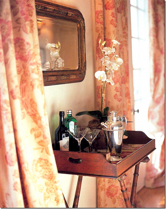
I love this picture from her Santa Barbara house with her English linen curtains. Slim loves the British Colonial look ala Out of Africa and it really shows in this vignette.
Source URL: http://interiordesignblogz.blogspot.com/2011/08/readers-kitchens-series-2.html
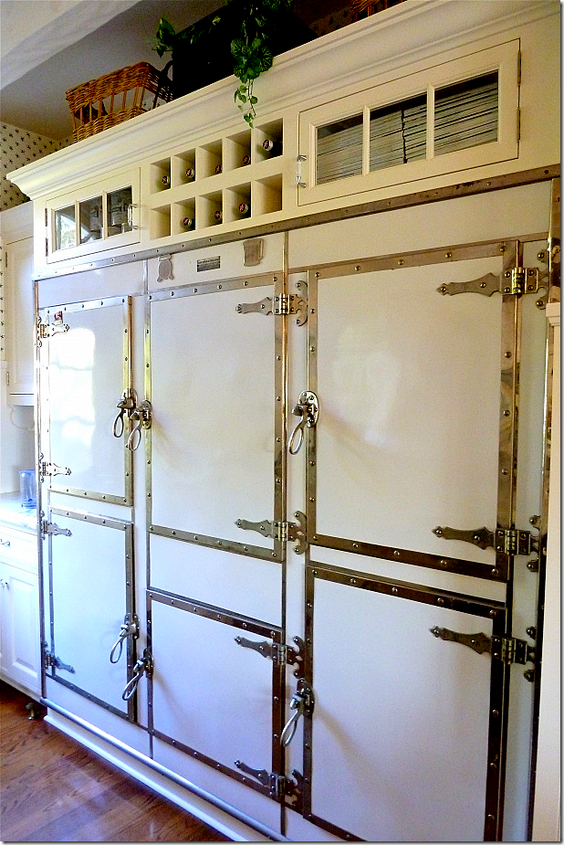
Her turn of the century Santa Barbara house came with this freezer. Amazing.
I love this picture she took out in her garden.
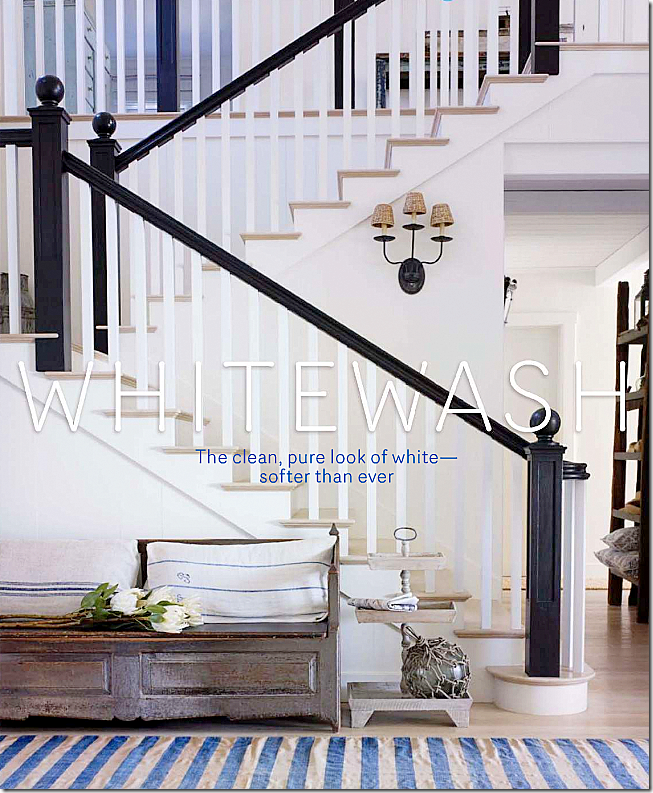
Last September, House Beautiful showcased her beach house. Many blogs showed the pictures – but few put it together that the house belonged to a fellow blogger.
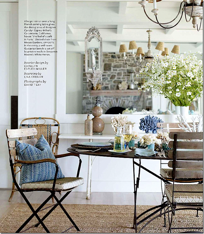
I love her beach dining room with its laid back furniture.
I actually just showed this picture in my coffee table story. I love this room. She designed her house around the antique Fortuny pillows she found.
But it was her slipcovered car that really made me soooo jealous! I want to do this sooo badly!!! Do you slip the back seats too or just the front seats???
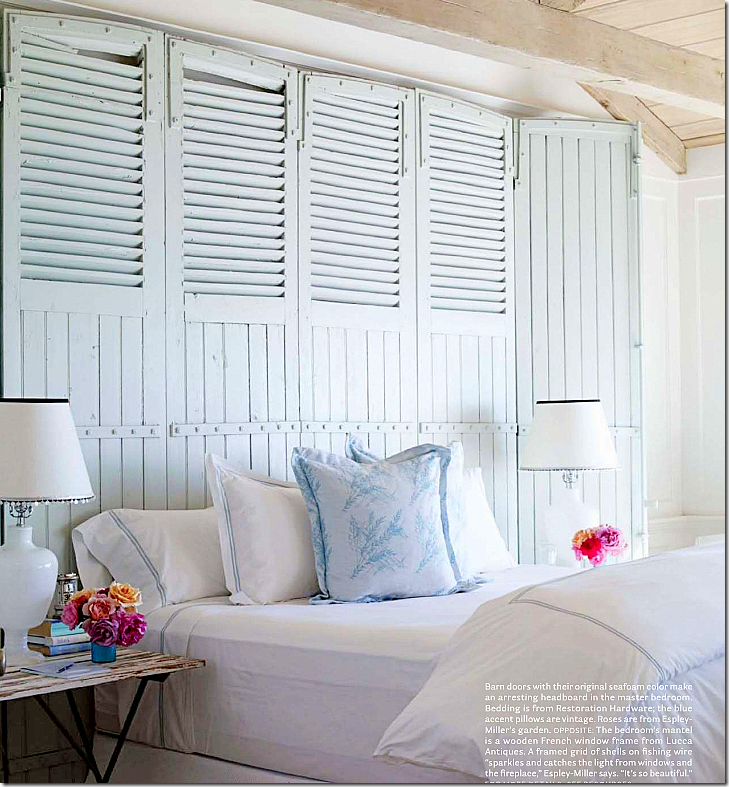
Barn doors become the headboard in this bedroom.
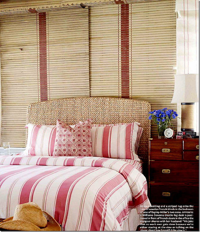
And this bedroom is all about stripes.
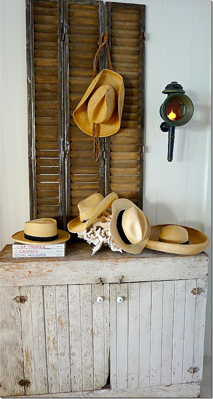
Slim Paley took this picture of her beach house’s entry.
And this picture of her dining table at the beach this summer is so soothing.
Finally, a huge thank you to Slim Paley for sending in this kitchen redo for the Readers Kitchens series. Be sure to visit her blog HERE to see all her gorgeous photographs.
There’s still plenty of time to send in your own pictures of your kitchen and/or house!
Visit Interior Design Blogs for Daily Updated Hairstyles Collection
