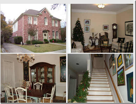
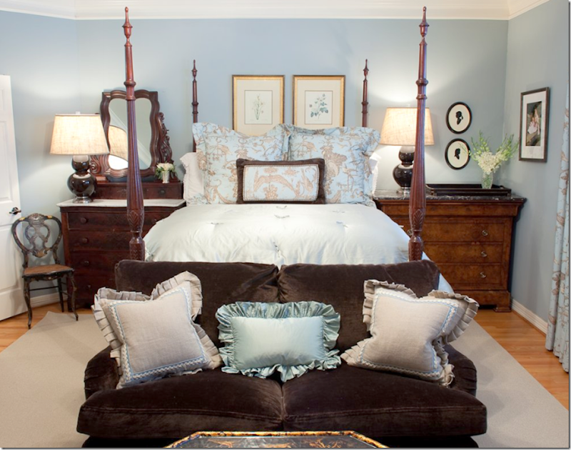
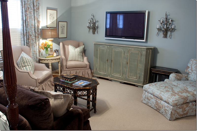
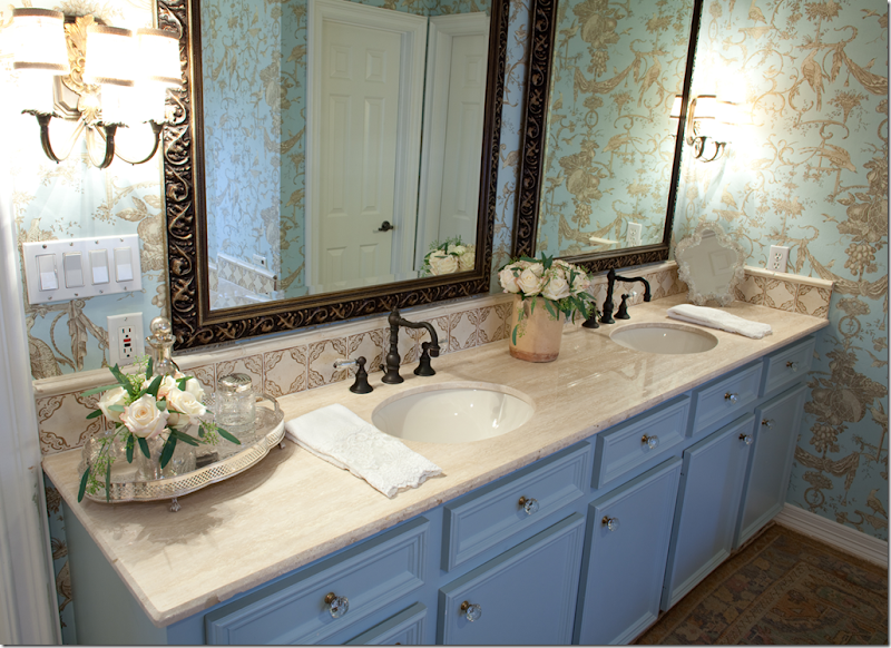
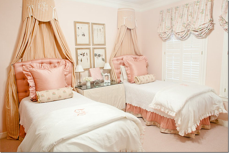
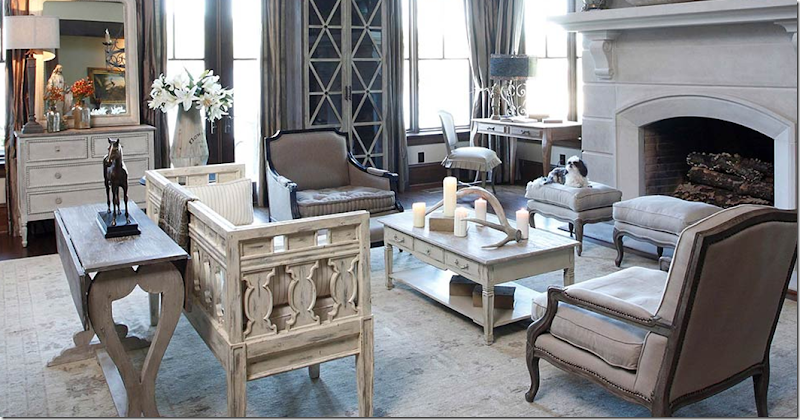
Elizabeth Munger, an interior designer from Houston, emailed me with a few pictures of some kitchen renos for the Readers Kitchens series. But, after looking at Munger Interiors’s web site, I was so impressed with their portfolio, I wanted to show it all! Elizabeth and her sister Amy started Munger Interiors in 2008. Besides interior design they also offer full service advisory for art acquisitions and collectors. Here are several projects Munger Interiors worked on recently – some of the rooms have “before” pictures. Enjoy!!!
THE FIRST HOUSE IS LOCATED IN THE WOODED AREA OF MEMORIAL:
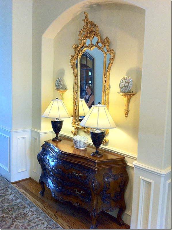
BEFORE: the entry hall and house was rather dressy.
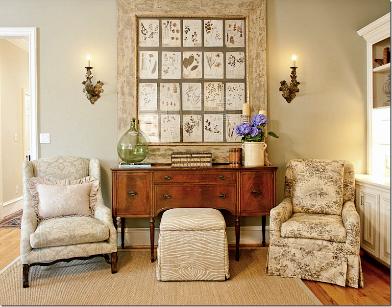
AFTER: Today, the space is casually elegant, though less formal. A set of herbiers from Watkins Culver take the place of the ornate mirror. French styled painted wood lamps sit atop a painted cabinet, also from Watkins Culver. I adore this newly designed entry! Leslie Sinclair of Segreto Finishes plastered the walls throughout.
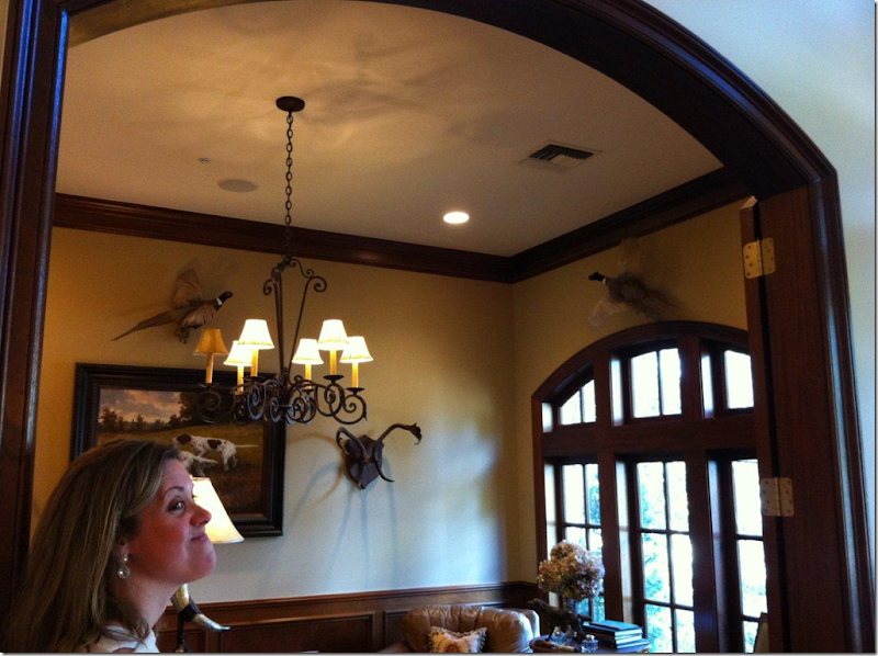
BEFORE: The study seemed very masculine with stuffed birds and hunting dog prints.
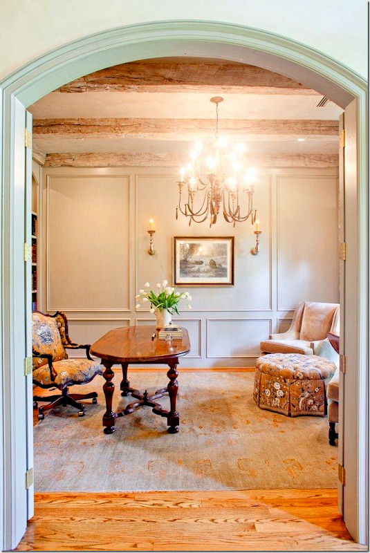
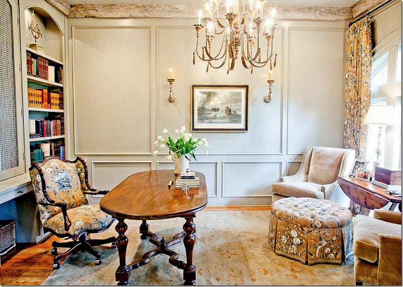
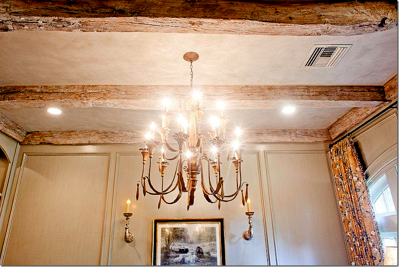
AFTER: The space was completely redone. The room was paneled by Custom Cabinets & Wall then painted “Intellectual Gray” by Sherwin Williams. Rustic ceiling beams were added. The Pierre Frey fabric on the ottoman, chair and curtains is one of Charles Faudree’s favorites. French accessories came from Joyce Horn and the desk is from Shabby Slips. Potter Construction was the contractor. Segreto did the plaster ceiling and the finishes on the the cabinets and paneling.
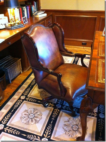
BEFORE: The chair was recovered and the rug was replaced.
The desk chair looks so much better now, upholstered in the Pierre Frey fabric. That desk!!!!!
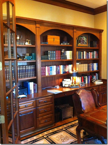
BEFORE: the book cases were nice, but busy looking.
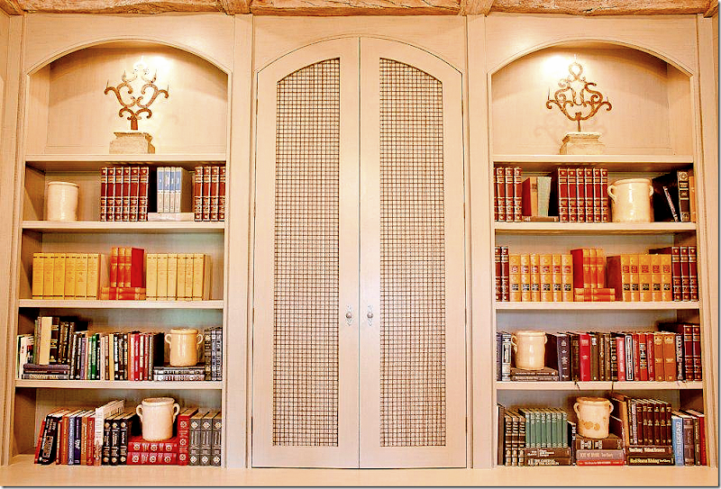
AFTER: Leslie’s finishes really make such a huge difference in a house. It’s hard to see how beautiful her work is on the computer – but her plaster and finishes are the best in Houston. Leslie has a book coming out this September and I can’t wait to read it! The desk is really special – just gorgeous.
Closeup of the bookcases. The more unattractive books are hiding in the new enclosed section. And yes, some books are not quite as pretty as others.
The beams are incredible looking! So antique looking!!
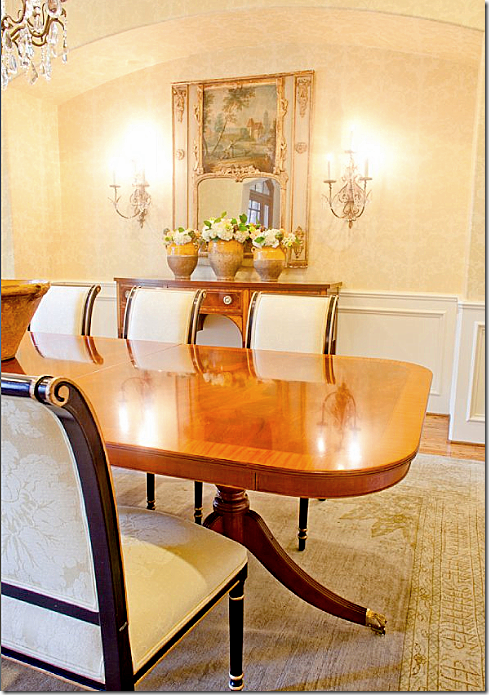
The dining room received a rug from Carol Piper while the sconces are from Vieux Interiors. The trumeau came from an antique sale.
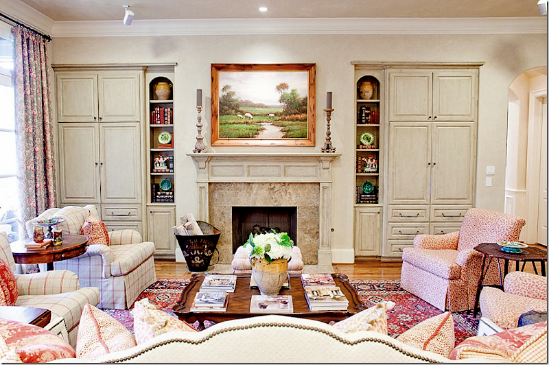
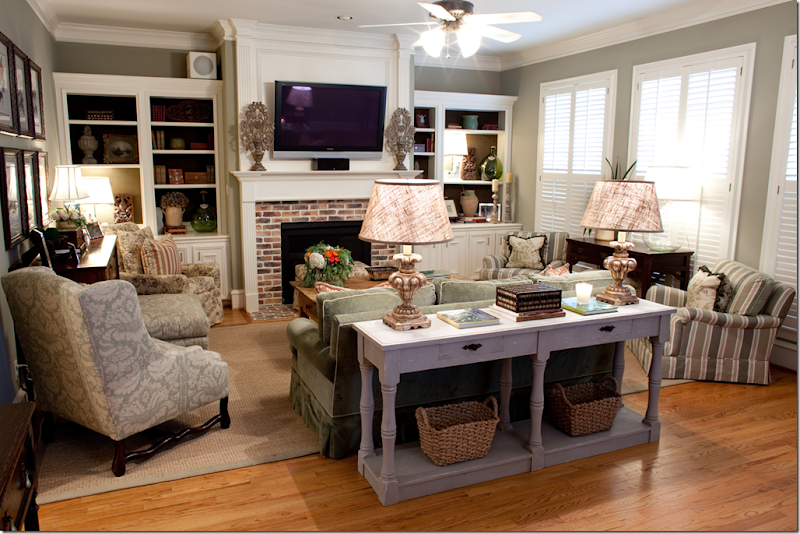
The family room has a definite French feel to it. Again, Segreto Finishes make all the difference with their softly fauxed cabinets and mantel.
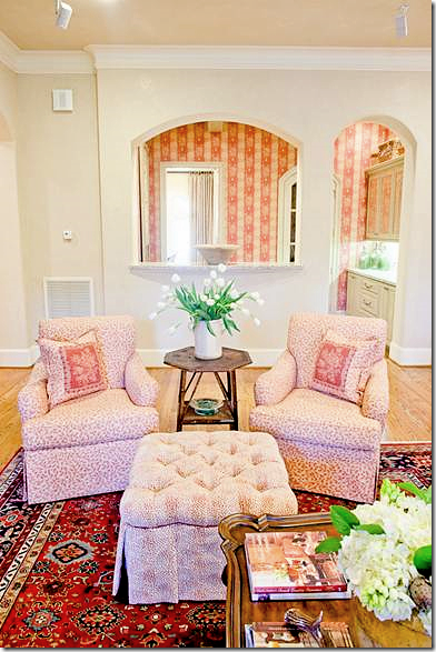
The club chairs are from Shabby Slips – the right pair wears a Cowtan and Tout plaid and the left pair wears Bennison’s famous linen leaf fabric. Pillows are Marvic and Cowtan and Tout. The sofa is custom.
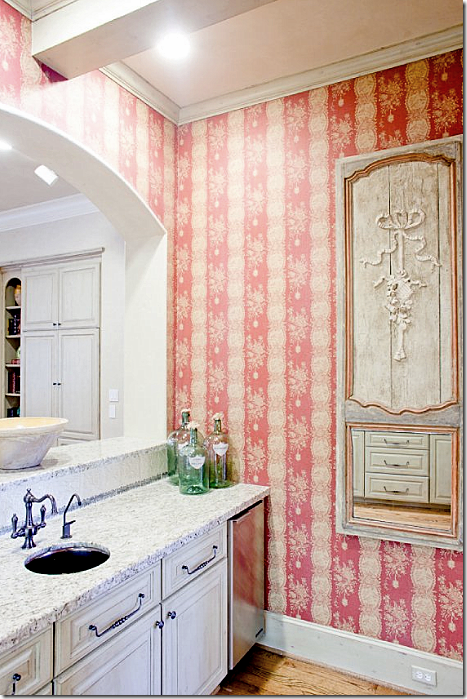
Here, the family room looks into the wet bar with its raspberry Marvic wallpaper. So cute! Custom Cowtan & Tout ottoman.
The trumeau is gorgeous – from Joyce Horn. Gorgeous hardware throughout.
NEXT THIS HOUSE IS LOCATED IN WEST UNIVERSITY-HOUSE #1:
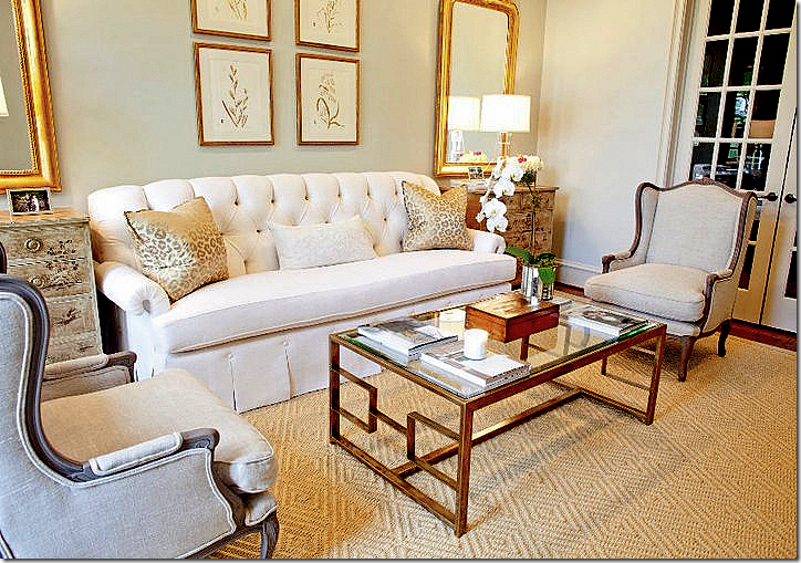
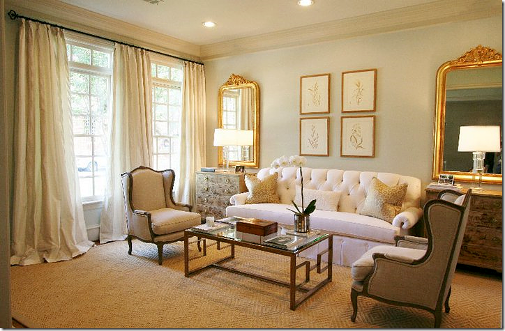
You know I’m going to love this house with its monochromatic living room! I love the touch of gilt in the contemporary Mecox coffee table and Louis Philippes. Sooo pretty!!!!! It’s elegant and dressy, yet youthful and not stuffy at all.
The paint color is Aloof Gray by Sherwin Williams. The wing chairs and chinoiserie chests came from Carl Moore Antiques. Prints from Vieux Interiors and the lamps are Circa. The rug is Stark.
Custom drapes are made of fabric from the Silk Trading Co. The sofa has such gorgeous lines. What a beautiful room.
BEFORE: the typical fireplace.
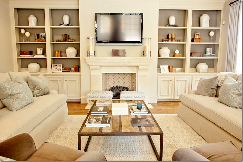
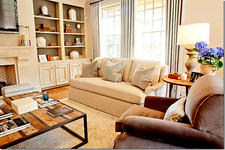
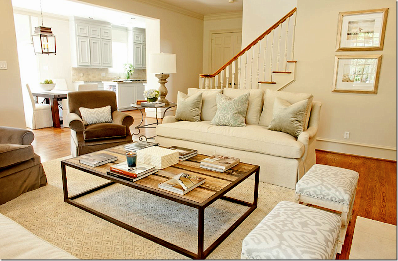
Wow! Gorgeous new fireplace. The beautiful fireplace is from Materials Marketing with a great herringbone pattern of cream colored bricks – love that. The family room is done in aquas, creams, and browns. The rug is from Stark, the David Hicks Collection. The hurricanes came from Krispen, with other accessories from AREA, along with the coffee table. MAI, a sponsor on Cote de Texas provided additional antique accessories. The fabric on the sofa is Donghia, Schumacher is on the benches, Fabricut velvet is on the pillows, and Pindler makes up the curtains.
The lamps came from Boxwood Interiors and the side table is from Mecox. I love how the back of the cabinets are painted a dark gray brown. It really makes all the accessories pop.
I love all the soft creams and aquas mixed with the brown velvets. So beautiful.
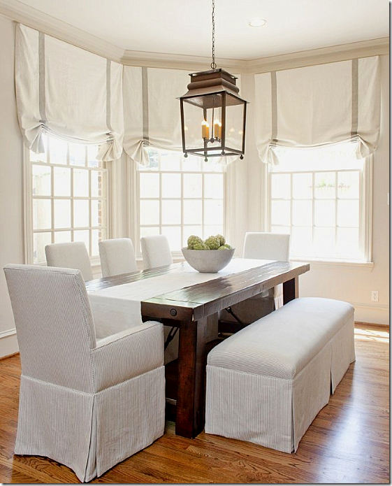
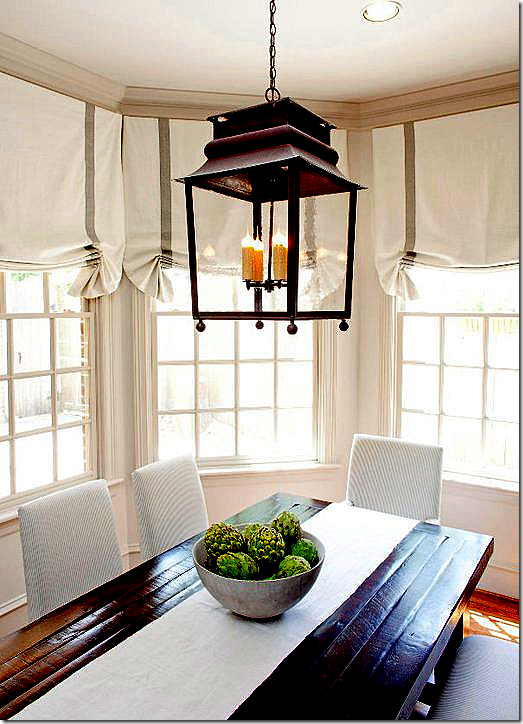
In the breakfast room, the shades, chairs and benches are Pindler and Pindler fabric with Samuel and Sons trim on the shades.
The lantern came from BROWN. I can’t wait to tell you this – but next month we are having another BROWN giveaway – a chandelier. Wait until you see it!!!! It’s fabulous. OK, back to the house! I really like the window treatment with the soft gray tape on the shades. Just the right amount of trim – understated!
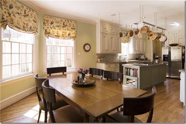
BEFORE: kitchen and breakfast room.
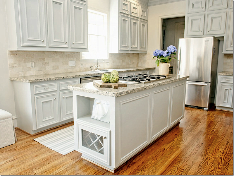
In the kitchen, the walls are painted Benjamin Moore’s Baby Fawn, while the cabinets are Wickham Gray. The rug is Dash and Albert. Antiques from Joyce Horn.
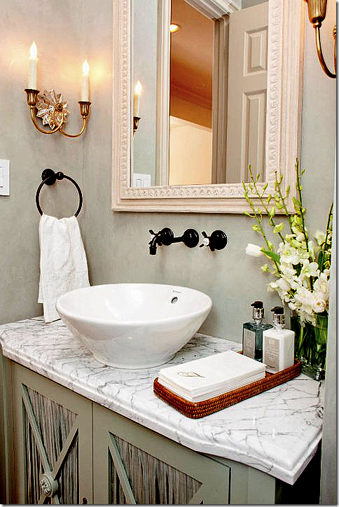
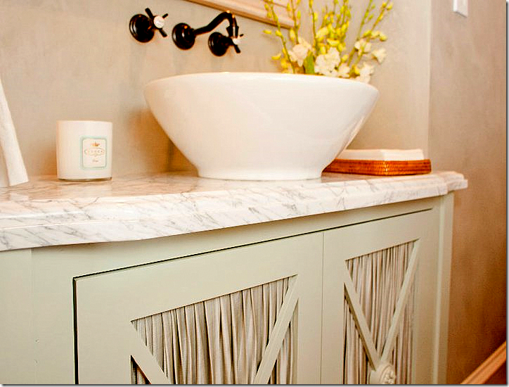
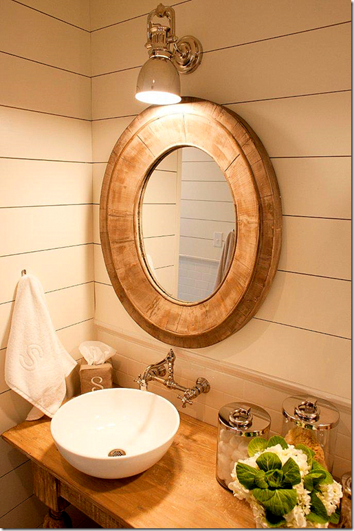
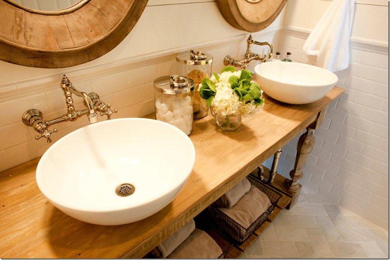
The powder room has a white marble top on a cabinet with skirted doors. Segreto plaster walls.
A close up of the beautifully pleated fabric from Rose Tarlow.
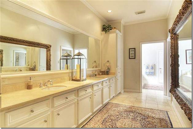
BEFORE: ho-hum master bathroom.
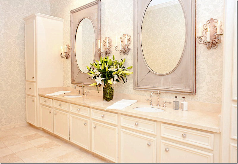
The master bathroom got a redo with fabulous painted mirrors from Joyce Horn and the sconces came from Boxwood Interiors. Amazing what new hardware, mirrors, sconces, and wallpaper can do to update a bathroom. I want to do this so badly to my own master bathroom. It really needs an update!
BEFORE: The playroom. Just wait for the update!!!! Are you ready?????
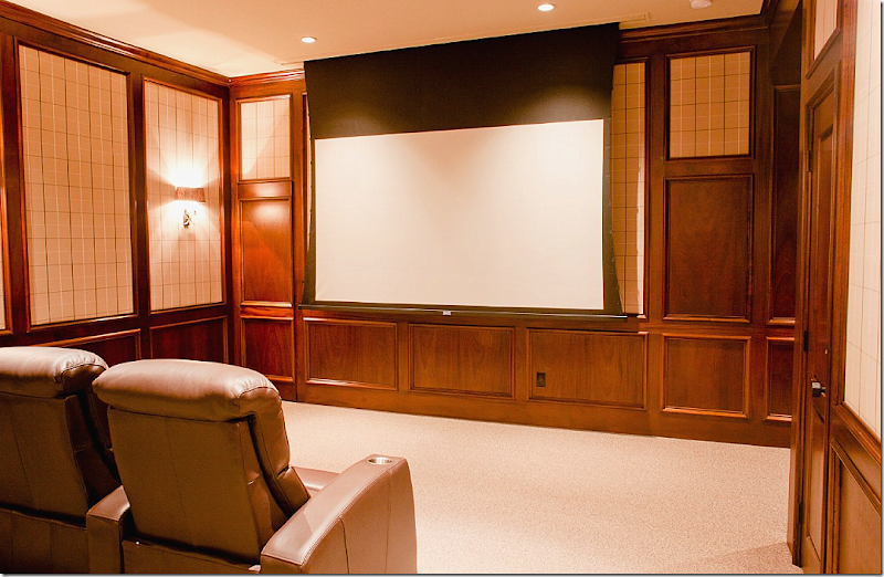
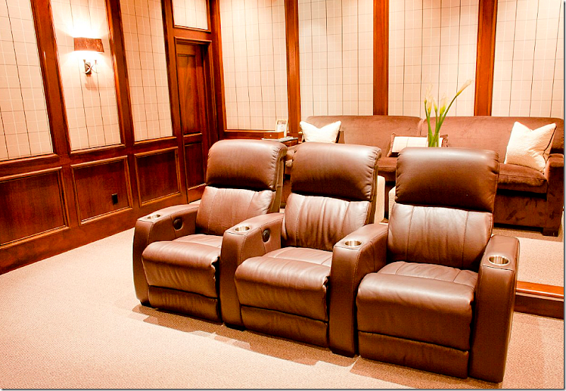
AFTER: A home theatre. Hard to believe this is the former play room! It’s so sophisticated looking. Potter Construction. AV: The AV Guys. Fabric on walls is Romo, Stark carpet, and Circa Lighting sconces. The side tables came from AREA.
Another view. I like the mixture of the theatre seats and a comfy sofa.
HOUSE IN SOUTHGATE – HOUSTON MUSEUM AREA:
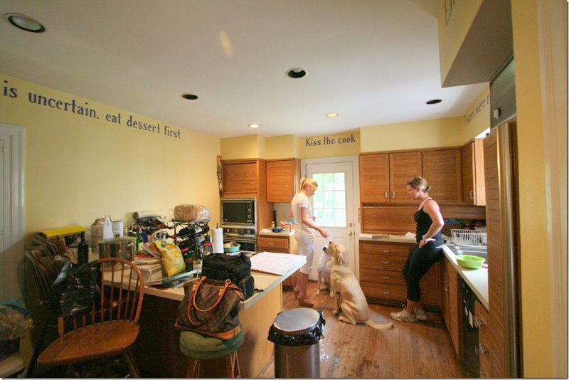
BEFORE: The kitchen was really dated and inefficient.
BEFORE: Another view of the kitchen looking towards the dining room. Ready to see the AFTER? Really???? You sure?
AFTER: Totally renovated kitchen. Incredible. Is this the same house? Walker Zanger silver leaf backsplash, Crema Marfil honed countertops, island countertop is walnut. MAI supplied the iron fixture. Custom color on cabinets started with BM’s Coventry Gray. Ashley Norton hardware.
A new sitting area off the kitchen. Club chairs have Rose Tarlow fabric. The sofa is leather and velvet with Rose Tarlow and Scalamandre pillows. Boxwood Interiors provided the lamps. The ottoman wears Cowtan and Tout fabric. Coffee table from Aidan Gray. Wall color is Sherwin Williams Dover White.
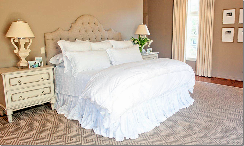
The bedroom is so pretty and serene. Stark rug, custom tables by The Joseph Company, Matteo bedding, Festoni lamps. Photographs by Andy Biggs.
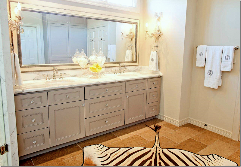
Master bathroom.
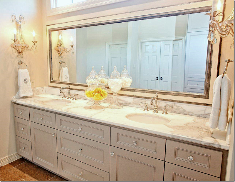
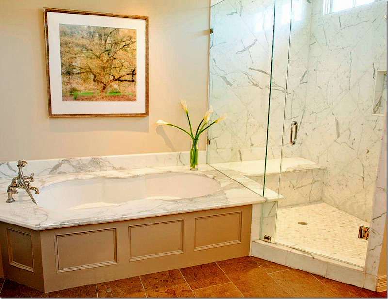
Another view. Baldwin crystal knobs. Calacutta marble. Custom mirror by Frametek. Curry and Co. sconces. Rohl faucets. The vanity is painted BM’s Ashley Gray.
Photograph above tub: artist, Lynn Geesaman
GALVESTON BAY HOUSE:
This bay house in Galveston was a total gut project. It was completed in just 5 weeks from start to finish! The contractor was Neil Potter with Potter Construction who finished in just five weeks, which is amazing judging by the pictures. Munger Interiors took two full days to install – the homeowners walked into a house with lit candles, fresh flowers and champagne in the refrigerator. That’s how an installation should be done – all at once, not piecemealed. The Munger sisters say this bay house was a dream project.
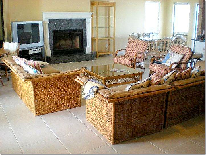
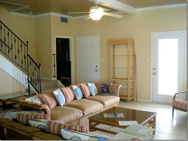
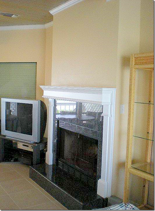
BEFORE: A typical beach house with lots of wicker furniture.
Really boring.
Now, remember this project took just FIVE weeks. Ready to see it finished????
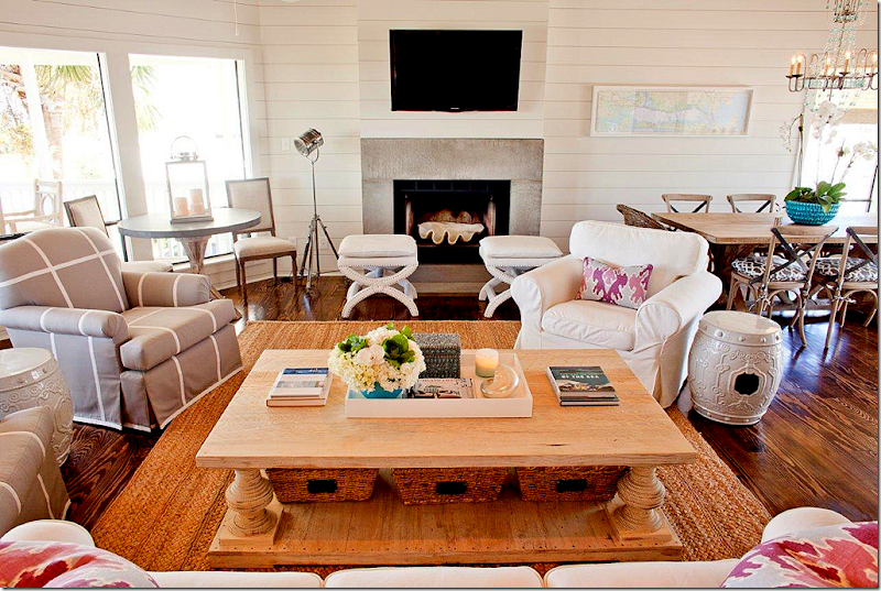
What a huge, huge difference! WOW!!!!! Amazing.
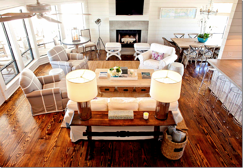
Looking down from the stairs. The kitchen is to the right. Here are the deets: Pine floors, concrete fireplace surround, shiplap walls painted BM China White, Pottery Barn rug, lamps and chandelier from Arteriors, Knoll bar stools, Lee Jofa Ikat pillows, Sunbrella fabric on the club chairs. Kitchen chairs are Aidan Gray with laminated Schumacher fabric cushions. The kitchen table and coffee table are Custom Furniture LA. Restoration Hardware ottomans in Sunbrella fabric. Game table with zinc top by Joseph Company. West Elm lacquer tray and Target Smith and Hawkin baskets. Got all that?
*
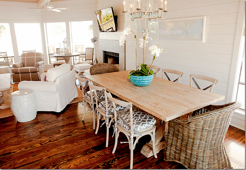
Loving the turquoise chandelier and the mix of the Kooboo with Aidan Gray chairs. Great dining room table.
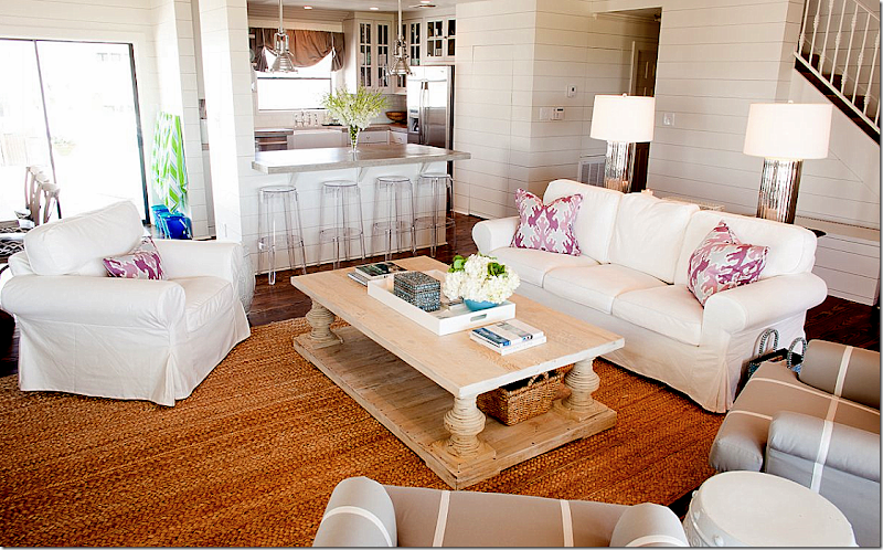
Looking towards the kitchen. Love the Kelly Wearstler ikat fabric on the pillow. The shiplap walls make all the difference here, along with the dark, pine floors. Both elements totally update the bay house that seemed stuck in the 90s.
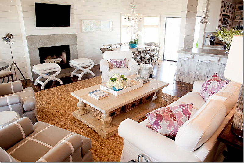
View towards the dining room. Love the large clam shell in the fireplace – cute idea!
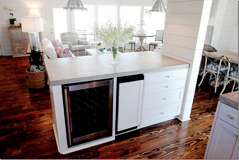
The kitchen opens to the living area – here they have a wine refrigerator and ice maker.
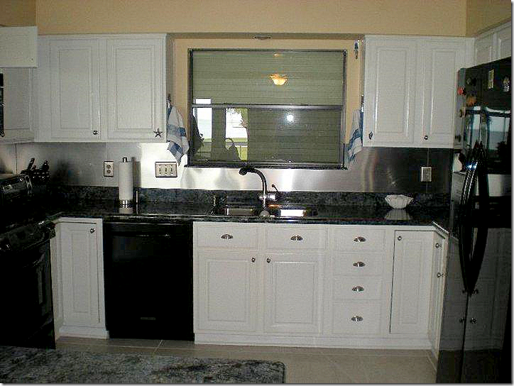
BEFORE: the kitchen had all black appliances and dark granite countertops.
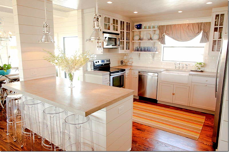
Now, there are light concrete countertops, Restoration Hardware light fixtures, Rohl Shaw farm sink and Dash and Albert rug. Cabinets are painted BM’s Harbor Gray. Glassware and dishes are from Ikea and Villeroy and Boch.
On to the bedrooms now.
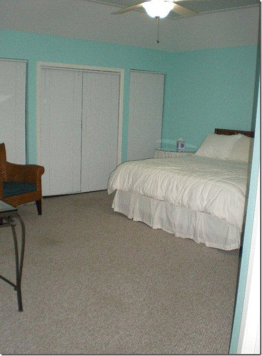
BEFORE: Boring master bedroom is a sea of gray carpet.
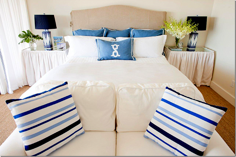
AFTER: So bright and beachy! I love the matching skirted tables. Lamps from Arteriors, bedding is Home Treasures from PLUSH, white loveseat is the famous Ikea slipcovered line. I love small sofas at the end of beds – a great alternative to a bench or stools. And seagrass – which is perfect for the beach.
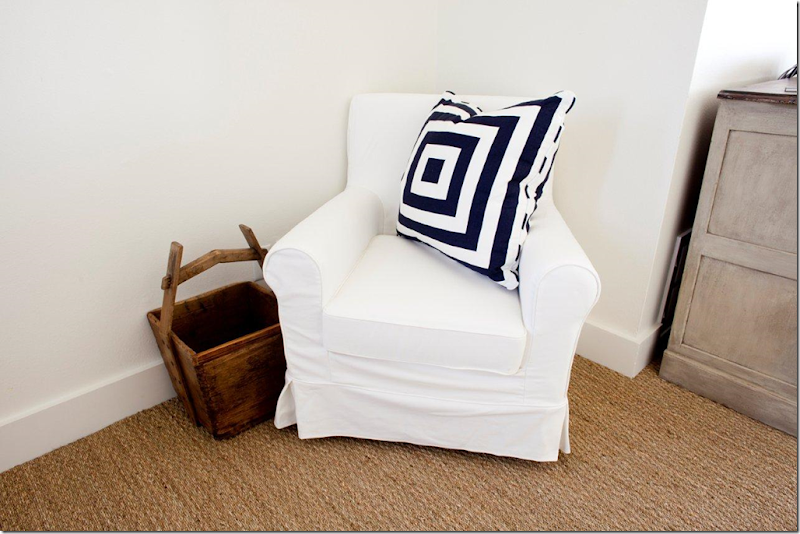
Master bedroom sitting area with the Ikea chair and pillow from Krispen.
BEFORE: Master bathroom.
AFTER: Absolutely fabulous! Love this so much!
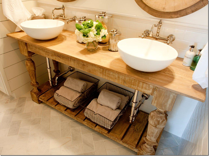
Great mirrors from Restoration Hardware. Sinks are Duravit. Rohl faucets. Dal Tile on the backsplash and walls. Arizona Tile on the floor.
The console is fabulous – it’s from Custom Furniture LA. I Love the wall hung faucets, too.
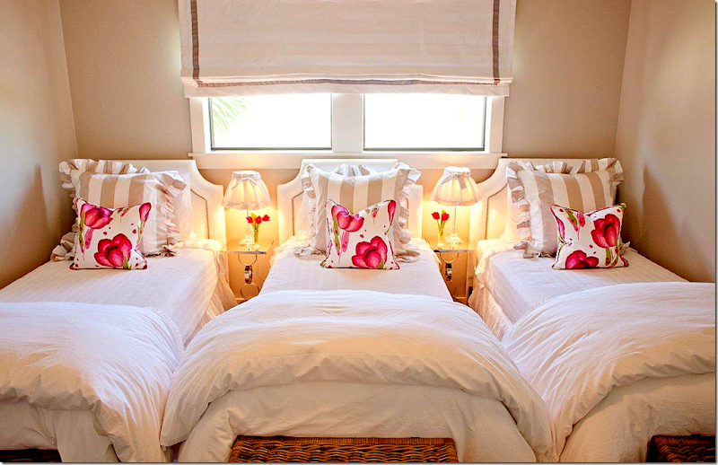
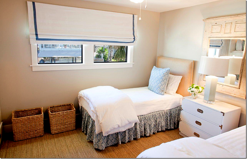
The girls bunk room has Pine Cone Hill beddings. Target lamps with custom shades, and Ikea baskets.
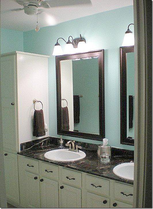
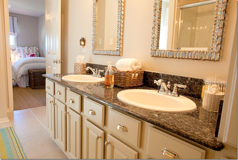
This bathroom just got cosmetic changes. The mirrors are Currey and Co., Dash and Albert rug, and Arteriors accessories.
BEFORE: Boy’s bunk room.
The boys bunk room has Pine Cone Hill bedding, Arteriors lamp, and the chest was a before item. The Mungers had it lacquered and replated. You can see it in the before picture – all brown.
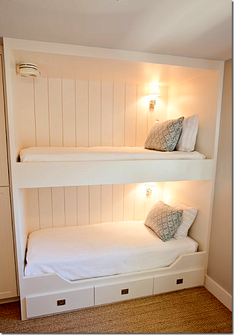
The boys bunk room actually has real bunks – room was made for them by removing a closet. Darling.
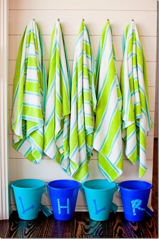
The Mungers bought these buckets at Michaels and painted one for each child as a surprise on their first visit to the “new” beach house. Towels are from Target. Details like this are what separates the mediocre interior designers from the better ones. It takes time and a lot of effort to take care of small design elements like this.
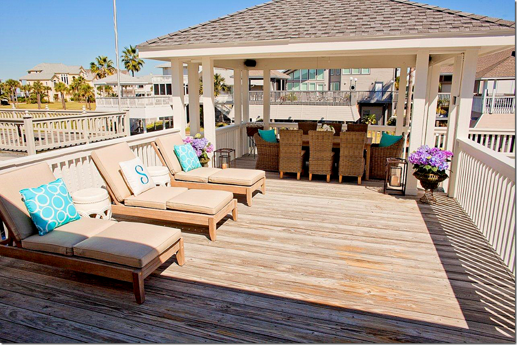
The boat house was outfitted with furniture from Restoration Hardware. Trina Turk fabric was used on the chairs. Garden seats are from Z Gallerie.
What a great place to eat – day or night.
Party’s on!
WEST UNIVESITY HOUSE #2:
BEFORE: This house in West University was in need of a total update.
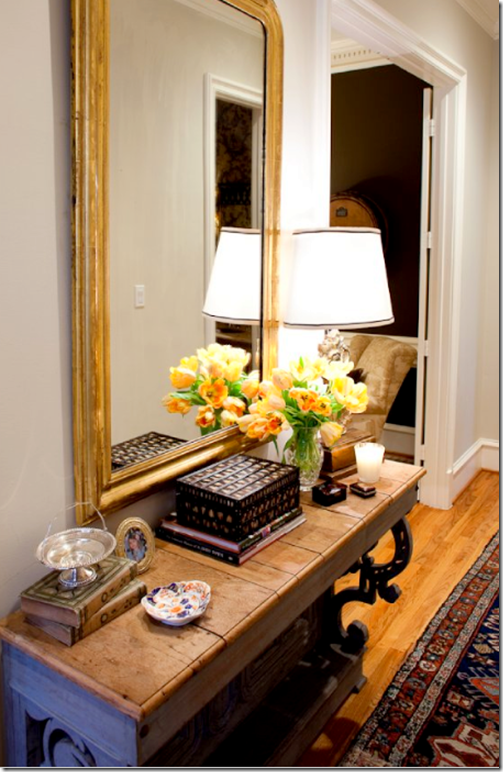
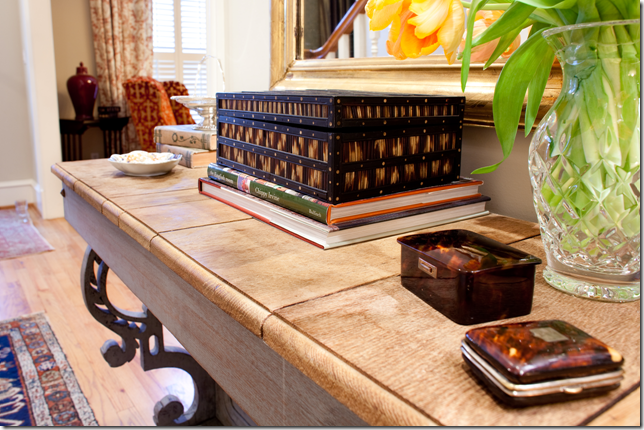
AFTER: The entry hall with a console from Carl Moore Antiques. The owners collect quill and tortoise shells boxes from London. Mirror is from Joyce Horn Antiques.
Close up of the tortoise shell and quill boxes.
The colorful living room is painted BM Bleeker Beige. Chandelier and trumeau are both from AREA. Curtain fabric is Carlton V, Scalamandre is on the wing chairs. Family antique table is on the left side, the other table is from AREA. Rug is from Nouri and Sons.
Another view – showing the curtains.
The dining room is completely changed with Stark wallcovering. The table is from Carl Moore and the chairs are from AREA. Silkworks fabric is on the backs. The host chairs are custom. Festoni candelabra, Joyce Horn sconces and confit jars.
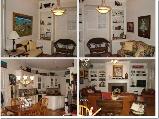
BEFORE: the study, kitchen, and family room.
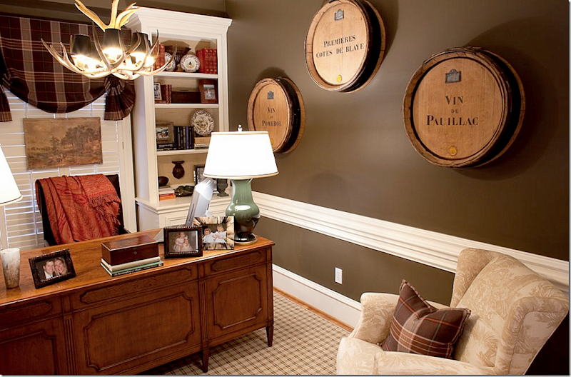
The study was painted a dark gray. The rug is from Stark with Festoni lamps and Ralph Lauren fabrics. The desk chair is custom. Wine barrels from Joyce Horn. I think the barrels are such a cute idea, especially in a man’s study.
The family room is done in sage greens while the back of the shelves are painted darker. I’m thinking I should do that too!
The herbier is from Joyce Horn, sconces from Round Top. Both chairs are in Brunschwig fabrics. I love that herbier!!! Such a pretty photograph.
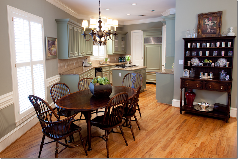
The kitchen and family room are painted Nantucket Gray with Sherwood Green on the cabinets. Carl Moore Table & Chairs
The console in the back entry way. Love the trumeau.
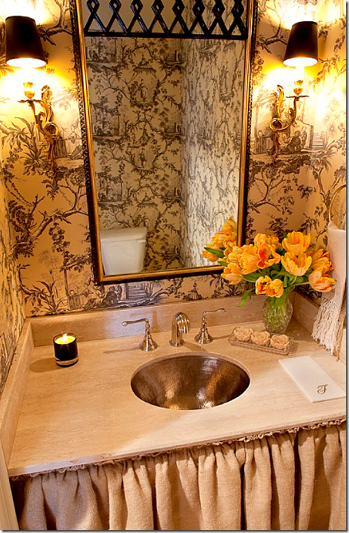
The powder was updated with Brunschwig paper and a new pewter sink and skirt.
BEFORE: The upstairs master bed and bath.
The homeowners original furniture was used and updated with new bedding and lamps. A velvet loveseat is in the sitting area in front of the bed.
The Mungers added a skirted console under the Venetian mirror.
New seating and a painted console were added to the sitting area.
The bathroom was totally updated with new travertine, wallpaper, mirrors, faucets and tiles. The wallpaper is Brunschwig and Fils.
In the daughter’s room, custom cornices were used with Chelsea Editions fabric. Plush Home bedding. Stark carpet.
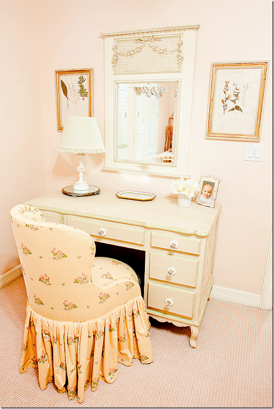
The desk and vanity chair – perfect for a little girl.
This bedroom has Stark carpet, Plush Home bedding, and chandelier by Joyce Horn. Of course I love this – it reminds me of my bedspread!!
And the vanity area – love the skirted kidney table.
AND FINALLY, TWO LAST IMAGES:
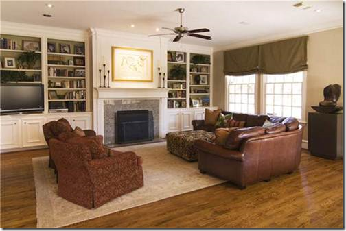
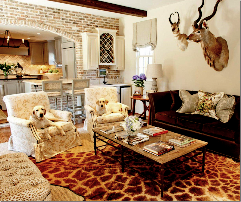
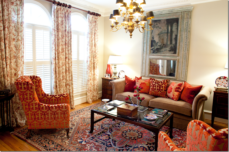
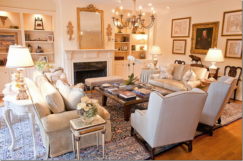
I found this image on the Munger’s web site and thought it looked so pretty. A family room, dressier than most, it shows the range of the Mungers. And it also shows, for once, that not everyone in Houston have white slipcovers and seagrass!! So beautiful.
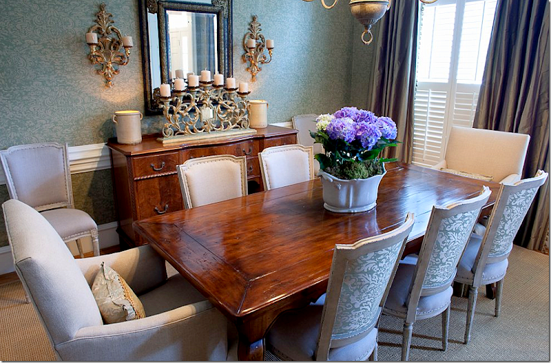
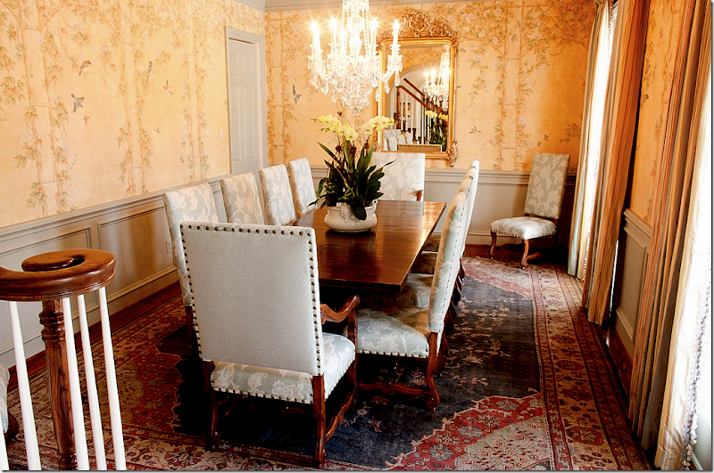
And I also found this image of a beautiful dining room. I just love the wallpaper – or is it a painted mural, hard to tell. This room really is pretty and again, dressy yet inviting. Just love this room.
Whew. I’m exhausted! It’s not often I get so many pictures of complete houses. It’s unusual in these times to get clients who want a total redo of every single room! What is your favorite house shown? My favorite is the West University #1 – with the white sofas – of course! I just loved that house and thought it was so elegant and lovely.
A huge thank you to the Munger sisters, Elizabeth and Amy. Be sure to visit their web site HERE for even more photographs!!
Today, I want to welcome three new sponsors to Cote de Texas. And, I want to take this time to thank all of you who click onto the sponsors web sites and look around. I have tried to choose sponsors whose merchandise has the look of the blog so that you all would enjoy “window shopping” with them.
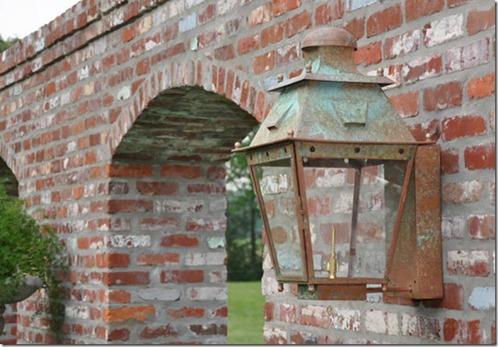
The first new sponsor is La Caze, an online décor shop, which specializes in furniture and in gorgeous lanterns, like the one shown above.
Next, we have Gabby - décor with a story. Their web site is so beautiful – this picture was taken directly from it.
Source URL: http://interiordesignblogz.blogspot.com/2011/08/munger-interiors.htmlAnd finally, we welcome the newest sponsor Boxwoods Fine Furnishings – who have everything from furniture to whatever you need for entertaining.
Remember, to visit any sponsors web site, all you need to do is click on their picture on the left sidebar.
Visit Interior Design Blogs for Daily Updated Hairstyles Collection
