Going to the book store these days to look for décor magazines is soooo depressing! There is so little available now! Since it seems like the economy is getting better, perhaps we can hope for some new titles in the future or maybe some old titles returning. That would be nice. Imagine Southern Accents being published again. If you do happen to be looking for a new magazine to read, the French language Campagne is an interesting one. Campagne tends to get overshadowed by the slicker Cote Sud and Cote Quest and that’s a shame. Most of the foreign décor magazines are so different than ours. The houses are not styled for the photoshoot, which can be either refreshing or off putting, depending on your personal preference. Campagne’s houses tend to be really not prepared, as if the photographer just showed up one morning, camera in tow, totally unexpected. But, it’s this easy approach to décor that is part of the appeal of the magazine. They have a great web site too – the best part being you can read the articles translated into English on your computer. The computerized translations are not perfect, but at least you can get the basic meaning of the stories. Here are a few houses from the magazine that caught my eye. Enjoy!
HOUSE #1:
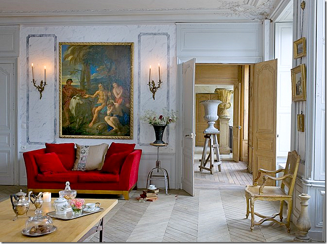
This hotel particulier, a Napoleon III styled mansion, was until recently used as a rehab hospital. It was purchased by a couple who are antique dealers. Together they restored the house to its once former glamour. Here, the main living area shows how the rooms are laid out on an enfilade. Notice the urns that are enfilade too: small, medium, then large. I love the shock of the red amidst all the blue and I love the lone urn standing on a rustic ladder.
The same room, opposite view. The house, built in 1860, came with historical documents which the owners used to recreate the original furnishings. When the house was bought, the original ceiling was hidden by a false one, which the new owners removed. They also faux marbled the walls in this room.
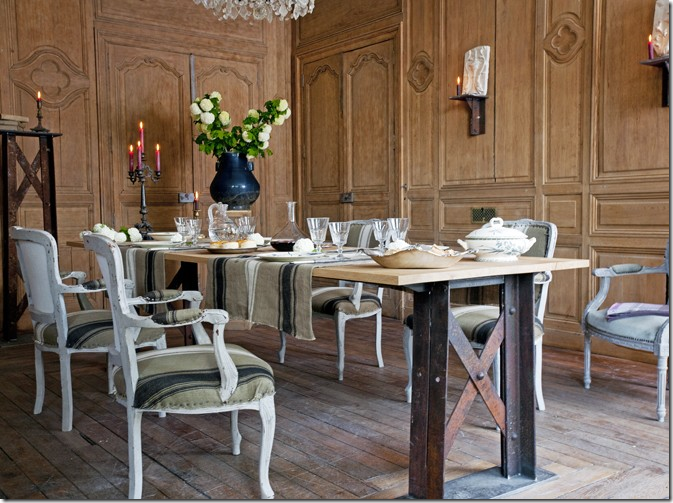
The floors are oak and were pickled and scraped using a brushed steel wool. The walls were stripped too. The owners mixed an industrial styled table with antique chairs covered in ticking.
The kitchen. I would love to see what is through that door!
Gorgeous red velvet fabric is used for curtains in this bedroom and the fabric’s color becomes the focal point.
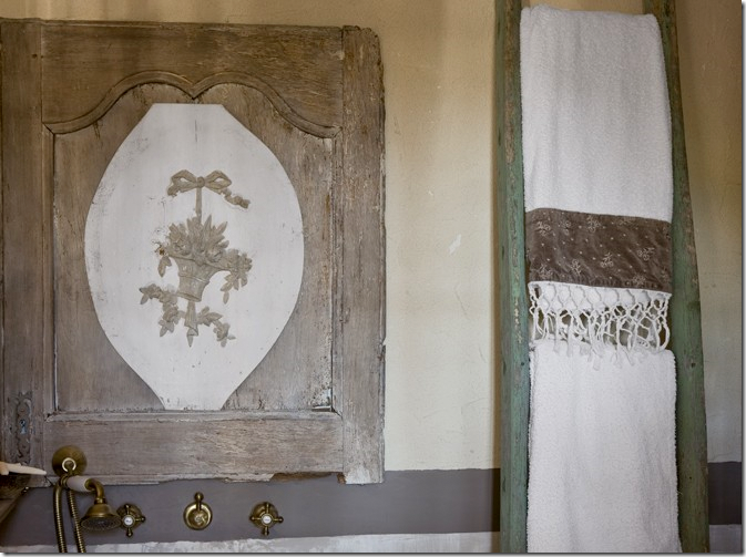
So original – you won’t see another bathroom like this, ever! The shower was made out old cement tiles.
HOUSE #2:
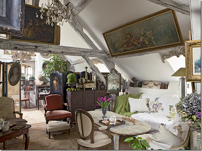
This house is in a village, one hour from Paris – part country and part city. The house is connected to the barn. Like the previous owners, these owners are in the decorating business. This house is magical – a complete utter mess of clutter – and it lures you trying to discover what is hiding in the corners. This living room sits in the barn part of the house.
The barn was sold off separately from the house over 50 years ago. Today, the new owners bought both the barn and house and reconnected them. Here, leaving the barn and entering the house.
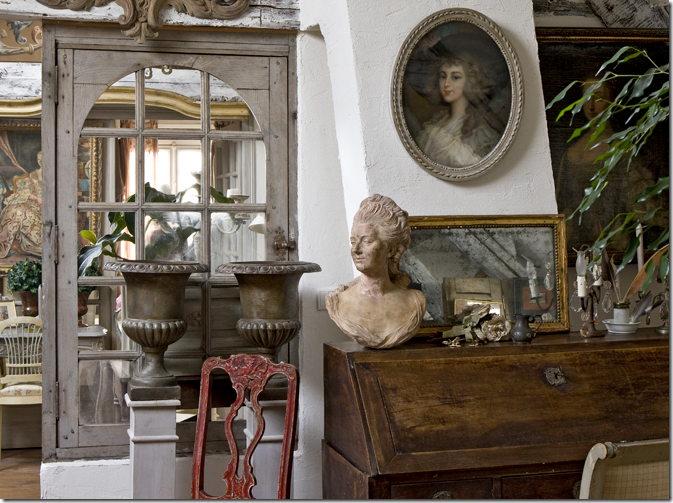
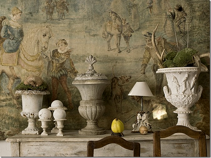
My favorite picture from this house. In the dining room, such a beautiful backdrop to a collection of urns.
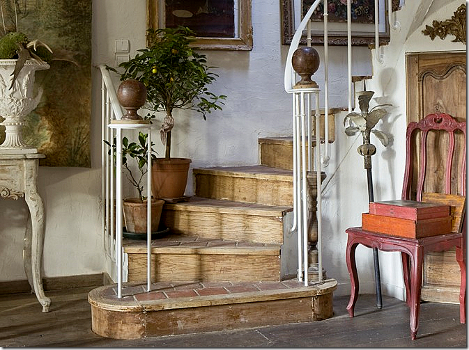
Rustic stairs – made of tile treads, wood and iron – topped with two antique bronze finials.
There is just so much clutter everywhere! You could look and look and still not see it all.
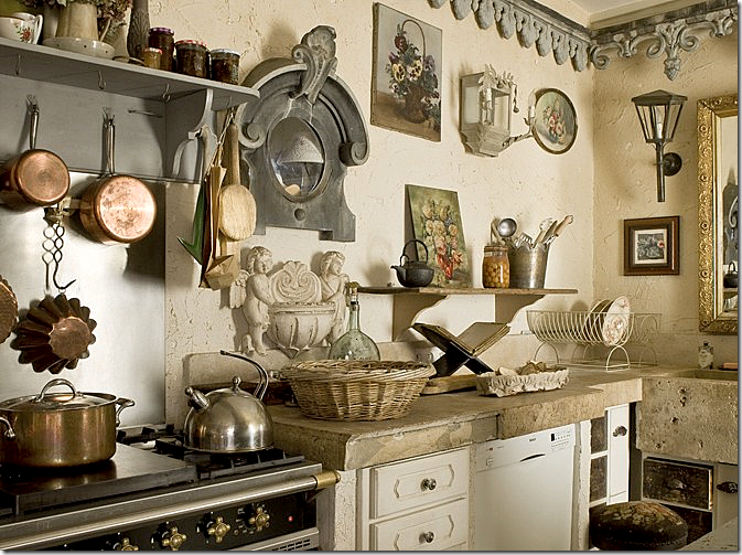
The kitchen with thick concrete countertops. Notice the “crown molding.”
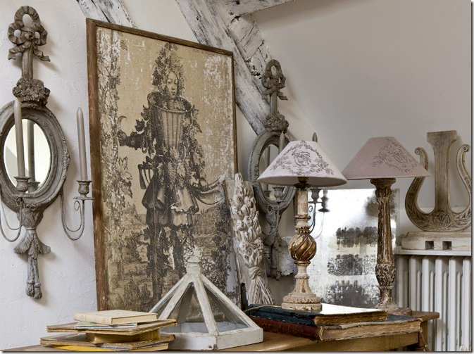
Vignettes are everywhere. I love those sconces and lamps.
The dining room almost seems quiet compared to the rest of the house.
You could take 1/10th of what they own and totally furnish a house with it.
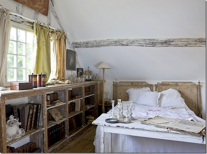
They stripped and limed the shelves – turning the library into a bedroom.
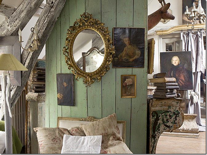
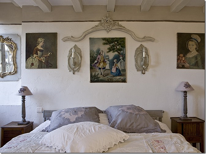
Another bedroom. I love those portraits – both of them!!
They made a medicine chest out of an old door.
HOUSE #3
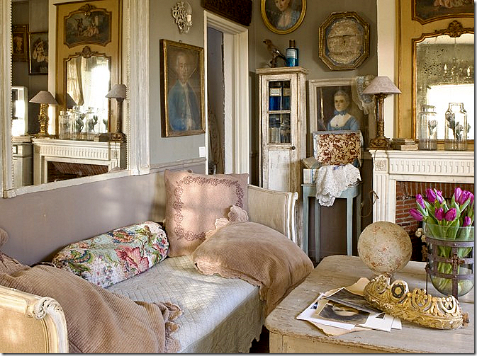
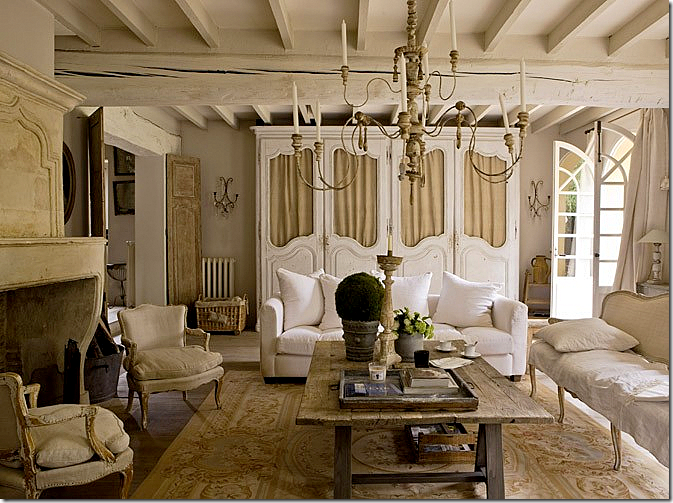
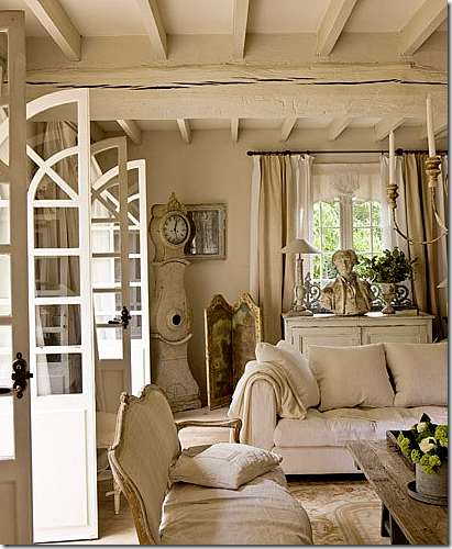
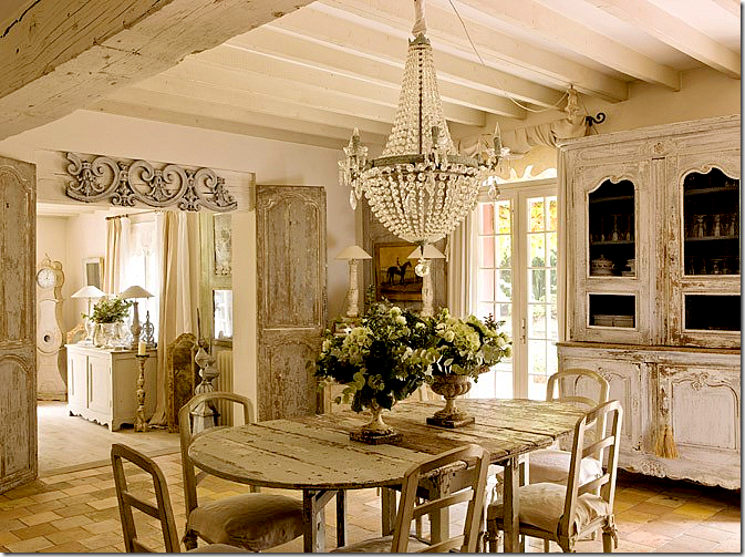
The owners of this house waited 10 years to buy it! Antique dealers and horse traders, their property caters to both sets of customers. I am so crazy about this living room! You could try for ages to get your house in the U.S. to look authentic like this, but you can never get it exactly right!
The décor is a mix of French and Swedish. A Swedish Mora clock stands in the corner.
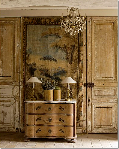
That door! That boiserie! That tapestry! That chandelier!
Past the living room is the dining room – all French and Swedish in whites and creams. Gorgeous!!!! Notice those doors leading from the living room.
The other side of the dining room showing the gorgeous fireplace, mirror and chandelier. Perfection – this picture makes me cry it’s so beautiful.
Source URL: http://interiordesignblogz.blogspot.com/2011/03/campaigning-for-campagne.html
A vignette by the dining room. Great lamps.
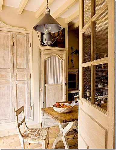
A view into the breakfast room and kitchen through the wired door. Notice the pantry doors.
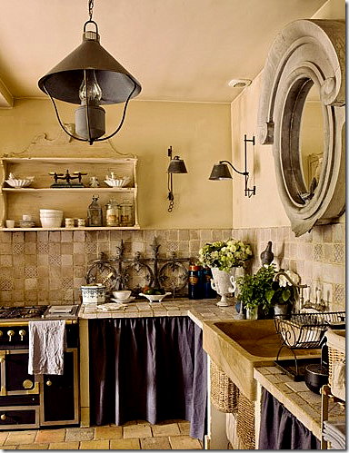
The kitchen. Love the light fixtures. Unfortunately – no pictures of bedrooms!!!!
As you can see, Campagne is no Southern Accents or Veranda. It’s houses aren’t styled in the way we are used to in America. And the French don’t live like we do – where every paper and scrap of mail is tidily put away the minute it’s discarded. They are much more relaxed about their houses than we are. If you like this look, check out the magazine – you’ll love it. If these types of interiors don’t appeal – run to the nearest Architectural Digest. Myself – I like a little of both and I suspect you do too????
THREE GIVEAWAYS ARE COMING!! WATCH FOR DETAILS!!
Visit Interior Design Blogs for Daily Updated Hairstyles Collection

