Source URL: http://interiordesignblogz.blogspot.com/2011/05/my-new-bedroom.html[
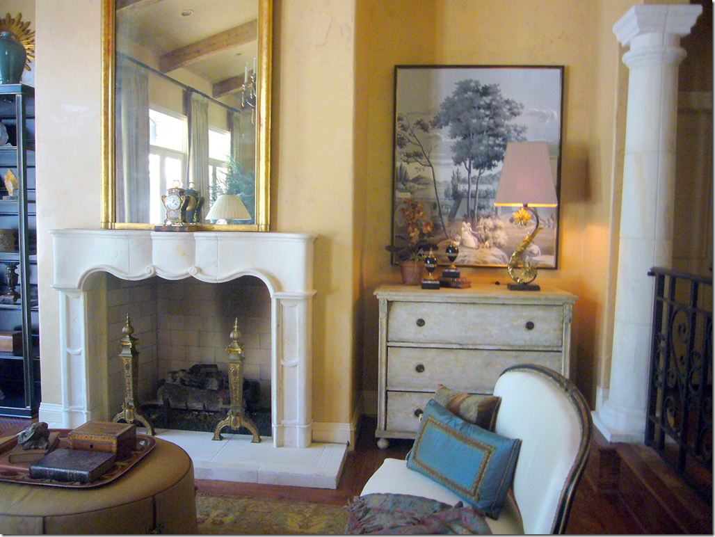
In late October, 2009, I wrote about my friend’s house in Dallas that had been decorated by Ray*Weitman HERE. On one side of her fireplace, the designers had placed an old piece of Zuber wallpaper over a Swedish chest – probably my favorite vignette in the large room. Several months later, I was very surprised to get an email from Simon P. Scott, owner of the to-the-trade décor company Jardins en Fleur HERE. Simon shocked me by saying that this picture above had inspired him to create an entire new line of framed paintings, resembling this Zuber relic. He wanted to do a giveaway to celebrate his new line – and together, we chose this painting, below, for the contest. It was a charming pink and gray chinoiserie that was perfect for a living room or a nursery HERE. Surprisingly, another blogger who lives about 1/2 mile from me was the winner!
Jardins en Fleur – part of a collection of framed chinoiserie paintings
After the giveaway, Simon and I talked about the wallpaper he carries and custom makes for his clients. The wallpaper, like the paintings, are handpainted in the manner of de Gournay and Gracie. Several times Simon offered to wallpaper a room for me, at no cost (!) At the time, I was decorating my daughter’s bedroom and seriously gave thought to papering her room in a beautiful blue and white design.
One choice was this design of Simon’s – here the blue and white paper is placed on a screen and is sold this way.
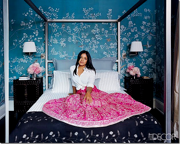
Another choice for Elisabeth’s room was this design of Simon’s – a traditional green chinoiserie paper shown here in an article in Elle Décor.
And there was this choice, the metallic paper which gives the paper a dressier feel.
In the end, I politely declined his nice offer and just painted Elisabeth’s bedroom instead. The subject was apparently not dead, though. About six months, Simon again raised the idea of my wallpapering a room – or a client’s room - using his paper. For advertising purposes, he needed a photograph of a room with his paper in it. Well, who am I to refuse a plea to help someone out, especially when free wallpaper is involved!?? Poor Simon. When the casual talks started getting more serious, he mentioned my powder room as a possible place for the paper. Except, my powder room was already wallpapered and I was happy with it. Instead, I offered up my bedroom to be wallpapered and then photographed for his catalogue. What else could a friend do? Simon readily agreed, without knowing quite how large my bedroom was and how many rolls it would take! After more than a few emails back and forth, we reached an agreement. He would provide the paper, I would provide my bedroom, and he would get professional photographs of the newly wallpapered room for his portfolio.
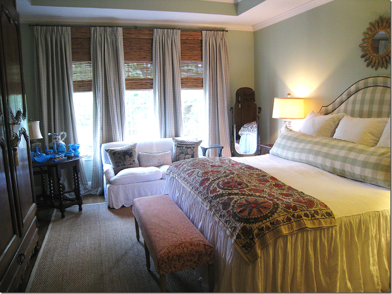
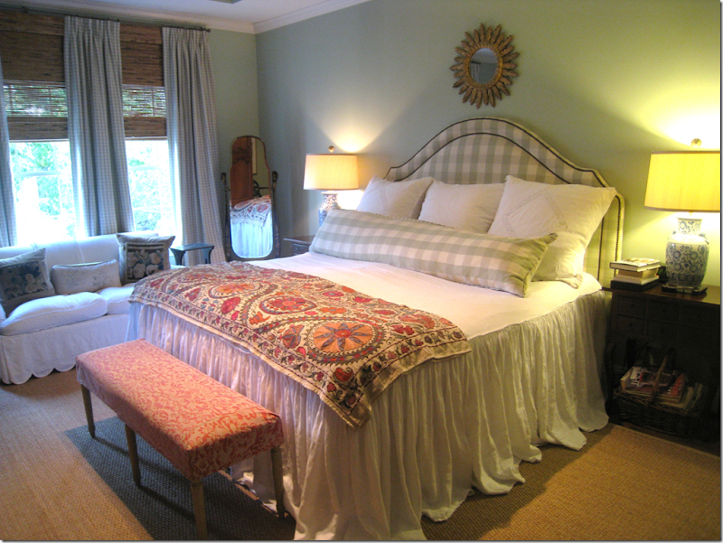
My bedroom - the room Simon and I chose to put the wallpaper in. My fabrics are mostly Chelsea Editions sage green with pink Fortuny.
LOOKING FOR INSPIRATION – NOT SO EASY A TASK!
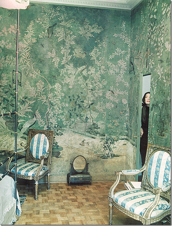
Pauline de Rothschild’s Paris apartment
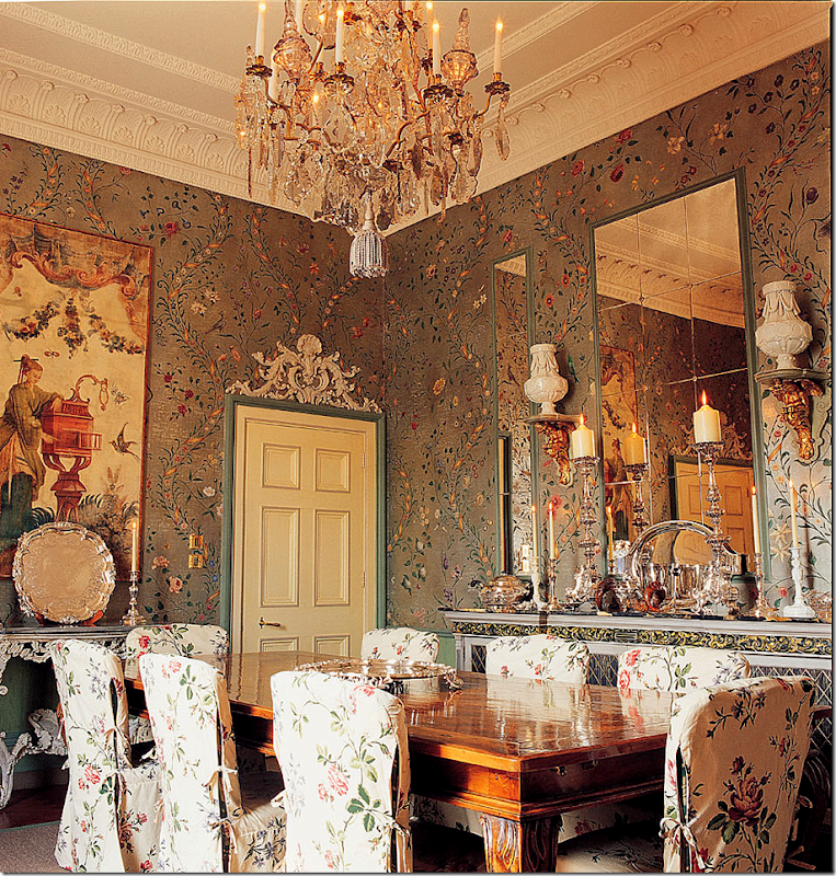
So, the question became what paper, what color, and what pattern should I choose? Simon was no help at all. He said he could make anything I wanted – the papers were handpainted in the orient somewhere – and the artists could reproduce any style I wanted. But what should I choose???? It was a lot like being let loose in Bloomingdales with a $100,000 gift certificate. The choices were endless. The above Pauline de Rothschild paper was a starting inspiration. I’ve always loved this pattern – it is utterly gorgeous - but I knew it was probably asking way too much to duplicate. Next.
There are a lot of iconic pictures such as this one with de Gournay and Gracie wallpapers. Miles Redd uses them a lot, especially in bedrooms. So, I turned to his web sight for inspiration. This kind of light, open pattern was a consideration.
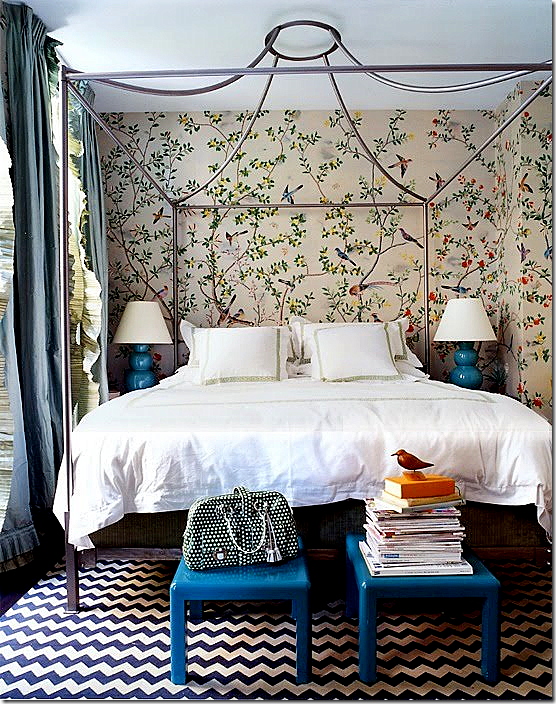
Another Miles Redd bedroom, that everyone has seen a million times before, looks almost like the same pattern above, except in blues and whites this time. I do love the simplicity of just two colors, with a few accents, but unfortunately, my fabrics are in greens!
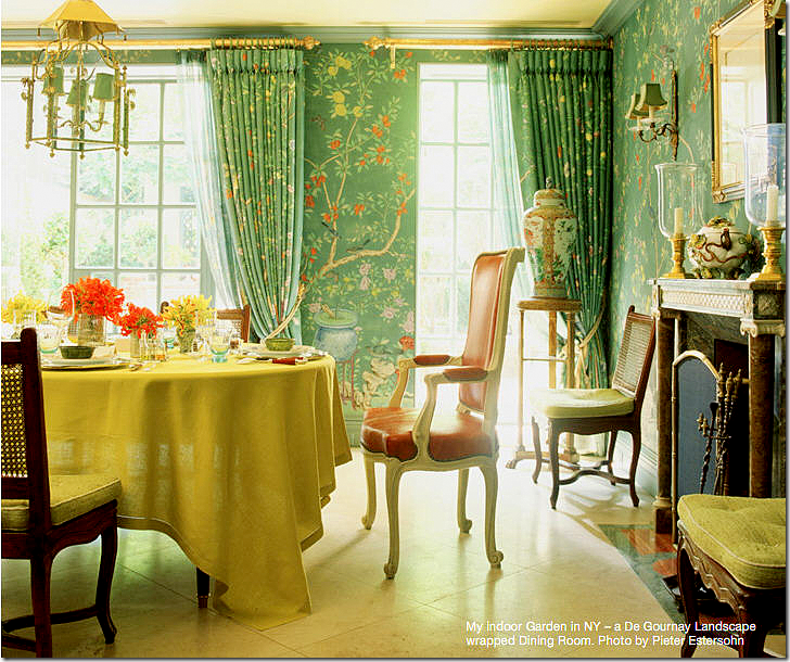
Charlotte Moss’ dining room is the right color, green, but I didn’t want flowerpots in my design.
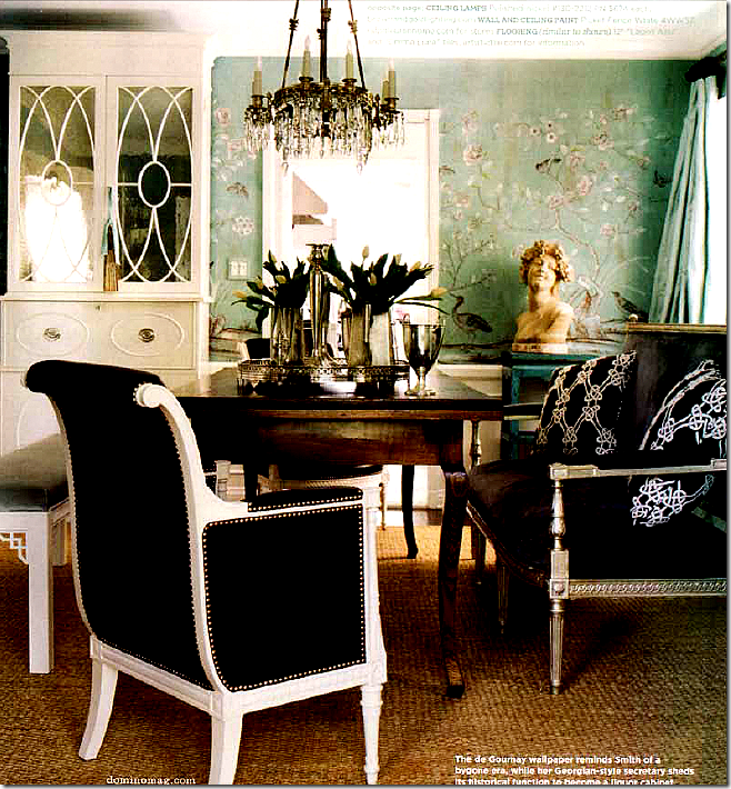
Another room seen a bizillion times is Windsor Smith’s former dining room in de Gournay paper. Even though this room is so old, I still love it as much today as when I first saw it. Windsor has been using a lot of these papers in light and icy blues, which I love. Again, my room has greens in it – so blues are out of the question. Maybe I should have just changed my fabrics?? Ugggh – I always second guess myself over and over again.
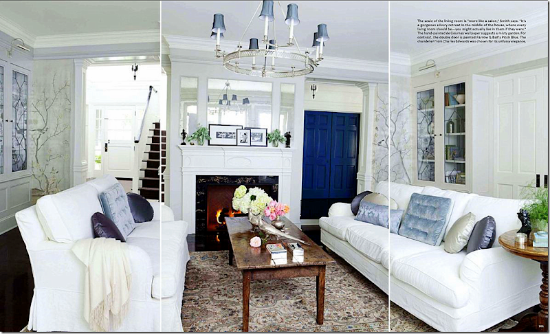
A very recent living room by Windsor Smith – soooooo gorgeous! If I had a room like this, I would die and go to heaven happy! Here she used de Gournay in the shiny, icy blues. Using the metallic instead of the matte paper was another decision to be made, but the metallic just seemed to dressy for my bedroom. Such a gorgeous room and paper!!! Blame House Beautiful for the awful lines in the photograph.
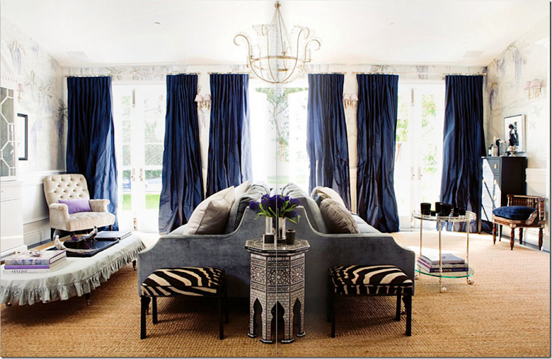
In this Windsor Smith room, the wallpaper pattern looks stylized, almost contemporary. But again, it’s metallic, reflective, and blue.
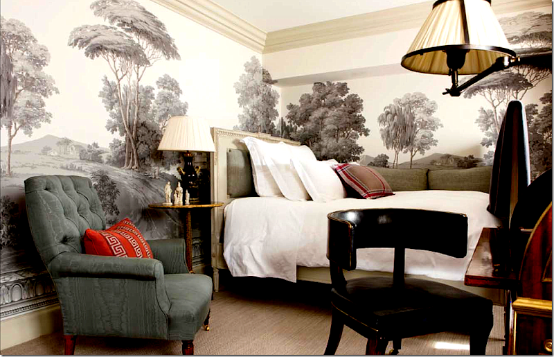
Michael Smith is another designer who loves chinoiserie wallpaper. He uses a lot from Gracie Studios. Here, though, he used a mural from Zuber. What a gorgeous room. My mind kept going back to this picture wondering if I wanted a Zuber type mural in my bedroom. Of course I did! Who wouldn’t want a bedroom that looks like this?
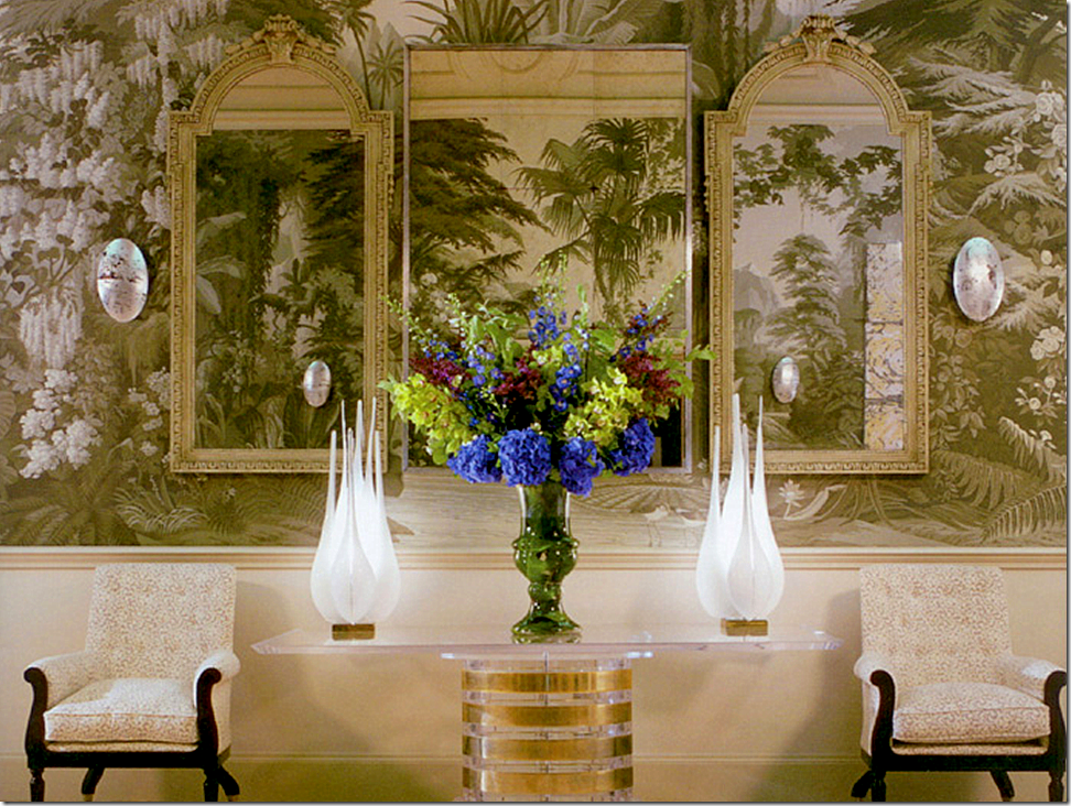
Or, how about a mural with some color, like this de Gournay? Finally though, I thought it would be too difficult to decide on what scene to pick for a mural wallpaper and decided to forget that idea.
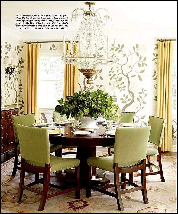
Another type of pattern really confused me in my decision making process. I am in love with the famous Swedish wallpaper found in Drottningholm Palace, seen above. A copy of this paper was given to Nancy Lancaster by the King of Sweden and it has since been duplicated by many designers over the years. The pattern is inspired by the chinoiserie papers, but the design is much more simple and plain. It has a very vertically linear quality to it with thick branches, painted dark that sensually curve from the floor to the ceiling.
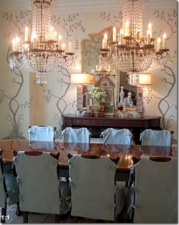
Peter Dunham used the Swedish paper as inspiration in this dining room. I sent this picture to Simon, but he felt I should go with the more traditional chinoiserie paper.
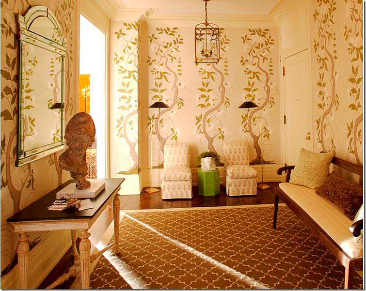
Timothy Whealon decorated this entry hall with the Swedish inspired wallpaper.
When I saw this dining room with yet another Swedish inspired paper in a room by Lisa Luby Ryan, I thought it was a sign that I should go with this pattern! But Simon discouraged this one too. Recently, he emailed me to say on second thought, how much he loved this type of pattern and would start producing it himself!! I think it would be a huge seller.
So with the Swedish paper out and the murals out, it came down to the traditional chinoiserie type of wallpaper.
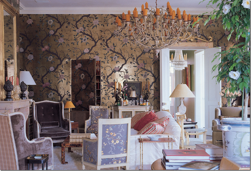
Did I want the shiny or matte finish? And did I want it on teapaper with obvious sections showing or not? While I love this wallpaper in a living room in New Orleans by Nicholas Haslam – it is just too dressy and shiny for me.
And the color was another major decision. Could it be blue with the green fabrics or just green? Or should I go with a pinkish color to pick up the pink Fortuny fabric in the room?
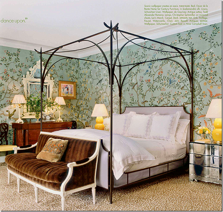
In the end, it was this picture that got the ball rolling. This bedroom was in Veranda late last year. Surprisingly, it is from a house in Houston, decorated by NY great Miles Redd. I’d wager a million dollars that this is the first Houston house ever done by Redd. The décor is fabulous – totally different than the typical Houston slipcover and seagrass design. But, pedigree aside, the more I looked at this picture, the more I thought this kind of pattern and color would be perfect in my bedroom.
With a pattern chosen, I had to first measure my bedroom – including the elevations and spaces above doors, under windows, etc. Then, I had to give Simon the background color I wanted – which I picked from Benjamin Moore. A few months went by and I got several samples to choose from – whether it was going to be on the tea paper or not. I decided to not go the tea paper route. It added a lot of money to the job, and I didn’t want Simon to go broke doing my bedroom!!! About two months later, the completed wallpaper arrived and my stomach fell to my feet. I don’t know why I was so nervous, but I truly was. What if I hated it after all this expense had been incurred on my behalf? What if I had measured wrong? I really should have had the wallpaper hangers measure, but I did it myself – something that I was worried about now that the paper was here. But, when I opened the box and looked at the paper, I knew it was going to be fine. It looked so beautiful all neatly rolled up in the box, with a diagram for the hangers to follow. I called Alan at Cannon Craft Wallcoverings - (713) 468-5491 - to come out and hang it – a job which took every bit of six full days to complete!!! And finally, here is what it looks like:
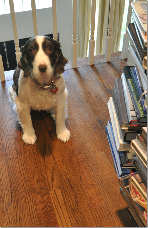
Oh wait, no, that’s Georgie, my nervous nelly dog who went nuts during the six days the crew was here! Ok, here’s the bedroom:
Well, I can’t really show Georgie without showing Sammie Jo too, that really wouldn’t be fair! Hi Sammie! She’s so cute. OK, do you think I’m nervous about showing you the bedroom or something????? ha! I guess I am. I hope you like it as much as I do:
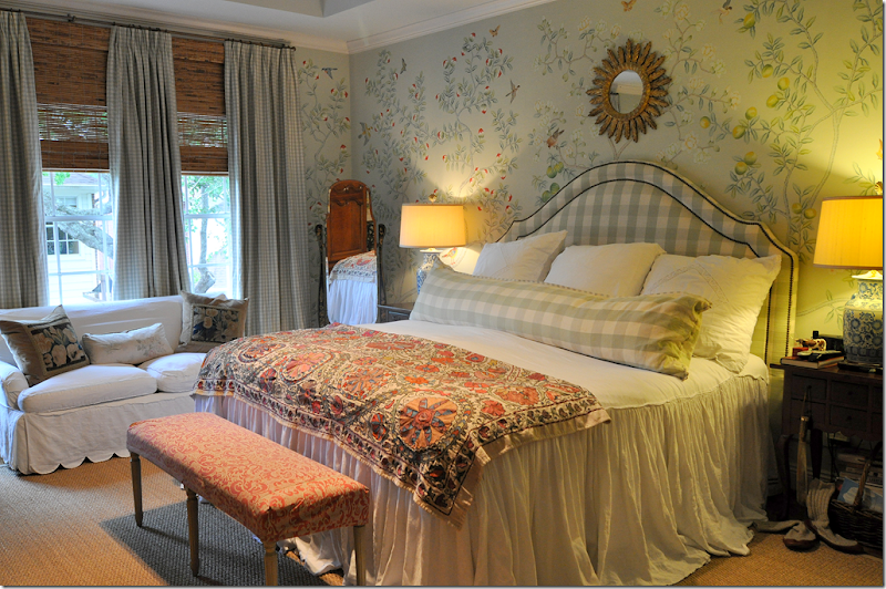
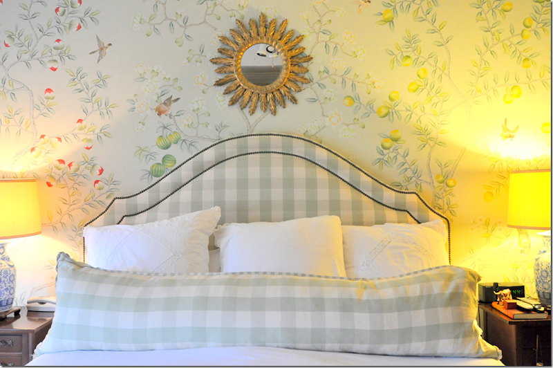
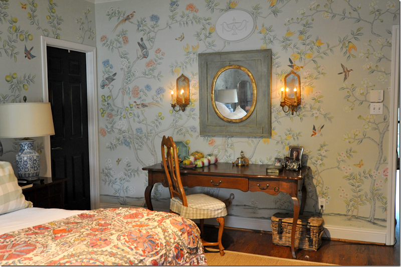
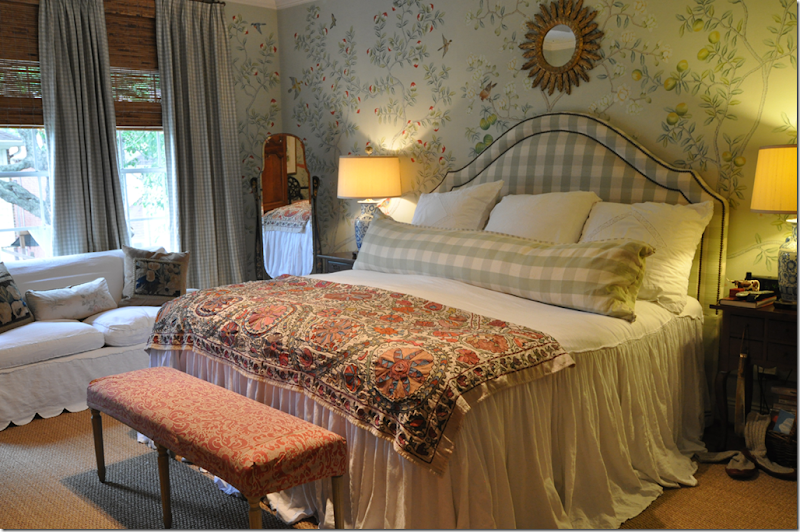
Ta-da! Here it is with the matte chinoiserie paper. Each panel is different from the other. To the right of the bed, you can see lemon trees. To the left of the bed are those half red things, which are supposedly peaches, I think!
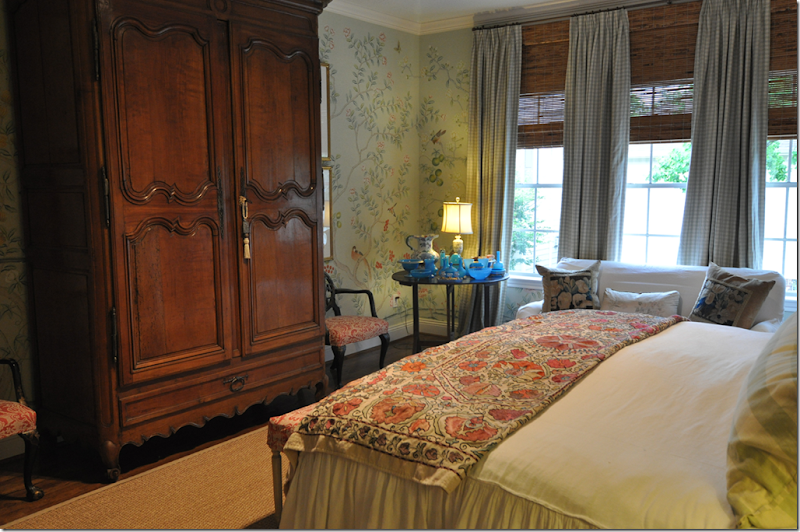
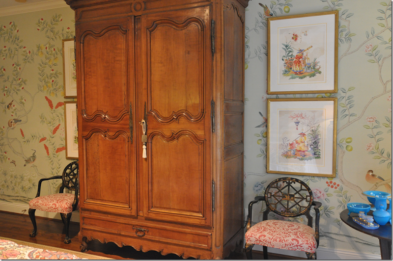
Looking towards the armoire where the TV is hidden.
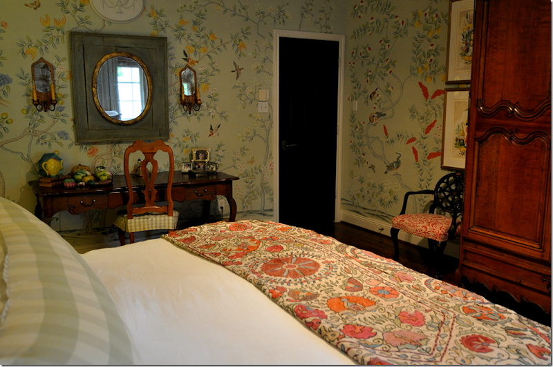
Looking towards my desk and the door to my bedroom. The panel that is directly to the left of the armoire is Ben’s favorite – it has these large orange flowers.
I rehung my four Harrison Howard pictures – amazing how I bought those chinoiserie prints a few years ago and how well they go with the paper!
Behind the bed is one of my favorite panels – with melons. Unfortunately you can’t see it all – but there’s another panel with melons in the corner behind the blue opaline glass.
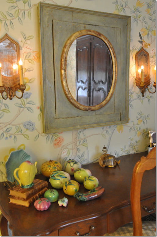
I put my Chinese altar fruit on my desk – moving it from my living room. It really matches the paper.
The paper in this corner is especially pretty – the melons are left of the curtains.
It’s impossible to get a picture showing all four Harrison Howard prints. You have to stand on the bed to get that shot.
The wall behind the desk is really pretty too. It’s all pretty!!
Did you notice Ben’s slipper socks next to his night stand? Just waiting for him to come home and put them on. Sexy!!!
That’s it! I can’t show any more pictures of the same four walls. I will say that if you buy a good wallpaper – be sure you get a good installer. Cannon took three days just getting the walls ready for the liner. The liner took a day to install, and the paper took two days to hang. They could have put it on in such a way that I could remove the paper whenever we move, but I decided against that step. I’m hoping the paper will only increase the value of the house????
Do I like it? I love it! It’s a subtle change, the pattern and color is very quiet so it doesn’t scream out at you when you walk in the room. But that’s perfect, I wouldn’t want it any other way. The craftsmanship is perfect – the artists who painted it are top rate. I didn’t see any errors or mistakes in the drawings. If you have ever thought about getting a chinoiserie wallpaper like this, be sure to contact Simon Scott and let him bid on for the job.
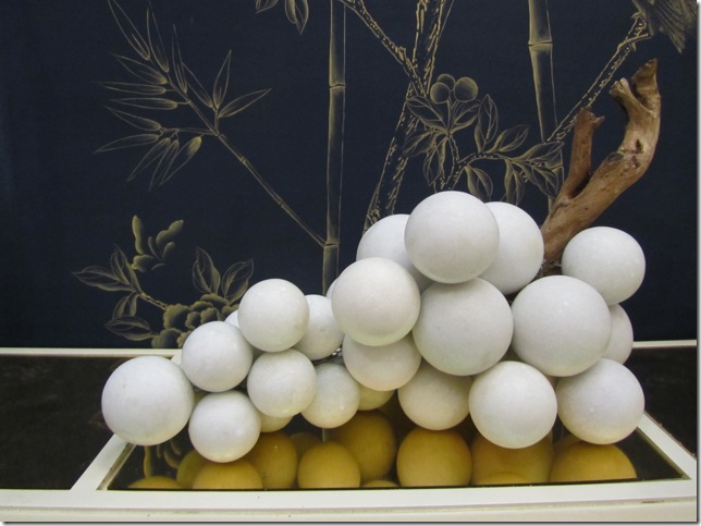
Simon’s company Jardins en Fleur is always changing, he designs new items when he gets an idea. Here, his large collection of marble grapes was a recent inspiration. And I thought I had a large collection of grapes!
Here are his newest item – the alabaster grapes which come in three sizes. They are so gorgeous! Bergdorf’s s sells them.
Simon recently got a big thrill when at the Kips Bay Showhouse 2011, Celerie Kemble used his grapes in the library. See them hiding under the table on the left? Another set was used on the fireplace hearth. After the showhouse closed, Kemble sold them on Gilt.com.
To peruse Simon’s web site, go HERE. If you are interested in the wallpaper, you can contact Simon through his web site.
A huge huge huge thank you to Simon Scott for the wallpaper! I hope you are happy with how the room turned out. I can never thank you enough for everything!!
Visit Interior Design Blogs for Daily Updated Hairstyles Collection
![[image16[1].png]](http://lh6.ggpht.com/_t8-Y4w1UKrc/S8WHf6gtOcI/AAAAAAAAv-I/XLveBi5ClTw/s1600/image16%5B1%5D.png)
![[image25[3].png]](https://blogger.googleusercontent.com/img/b/R29vZ2xl/AVvXsEhTQCjtAdYwUHzHbgiZDHhTnp7zkPP7neIMPBjuj8JptAlEPug5oeYTKgflQQ5ukCUcBvzS47QqjcpM0KeYOSxfwfIOpt-mT0sK2o1l6o9Kep-okWe790V69CHwdxVm1Wo8w0r1mdzZB-M/s1600/image25%5B3%5D.png)

![[image28[2].png]](https://blogger.googleusercontent.com/img/b/R29vZ2xl/AVvXsEgas7pSkjwQ542n99neYZXh8A7Hyd2hJw2zxOUZpNYYrUs_TaZqeC1bTGUv-6J5ffWS4mnWv5PDOWcJlMdZ8WUpMAvh7E-2TJICJ2qShHdDHLALoEIGlbQkUfzurdc4u7Vu9Uwg6py49Qil/s1600/image28%5B2%5D.png)
