I love hearing from readers who have gotten inspiration from stories on Cote de Texas. Reading about your personal decorating stories make it all worthwhile. It’s so much fun to see how one person is influenced from a redo, which in turn inspires another person’s redo. And, that’s exactly what happened with this story. Enjoy!
Below are the two kitchen renovations that inspired a reader’s own redo:
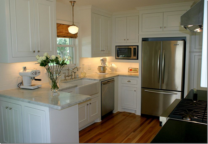
Inspiration Kitchen #1
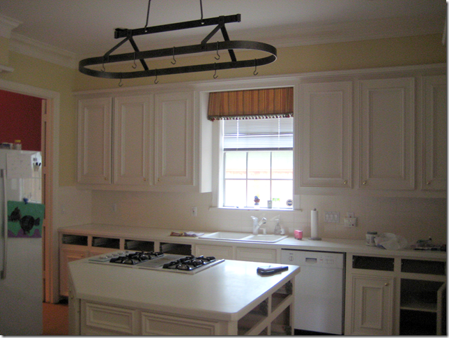
BEFORE: what this kitchen looked liked with white Corian, white appliances, yellow walls, and an inset sink.
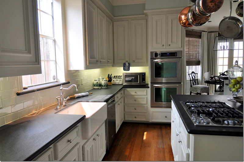
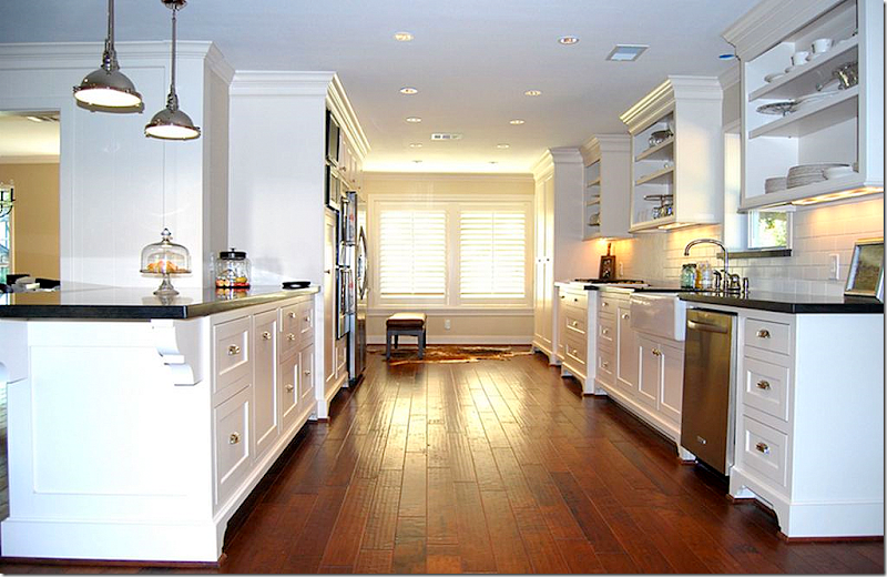
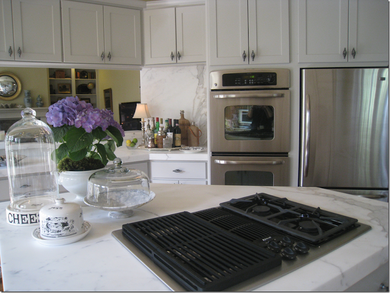
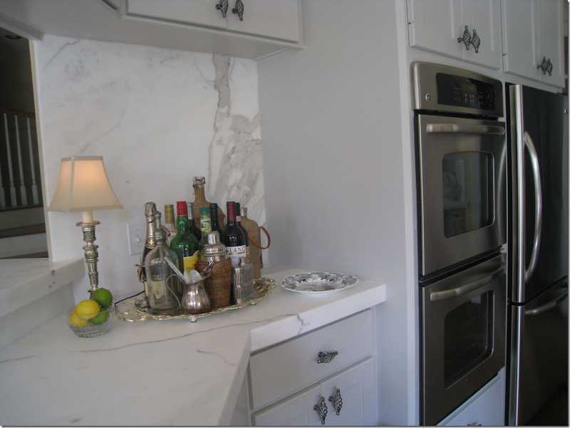
AFTER: For this client, I kept the changes simple. The white Corian was changed out for honed black granite and a creamy white subway tile backsplash. White appliances became stainless and a farm sink was added, along with a new faucet and knobs.
I wrote about this kitchen redo last summer HERE and HERE. It was part of a complete remodeling of the family room, dining room and study. The house is almost 15 years old now and the kitchen was becoming dated. We could have ripped the whole room out and started over, but the cabinets were still in good shape. Instead of a total renovation, the client opted for a more economical facelift. In the end, we changed out the counters and appliances and sink. We also painted the cabinets and the walls.
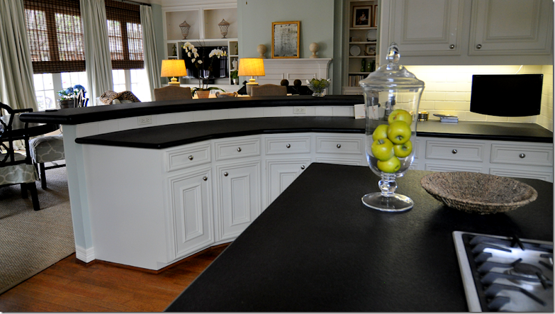
AFTER: The kitchen has a large, curved bar that leads into the family room and breakfast area. We painted the yellow walls a soft aqua so that the kitchen flowed into the family room.
INSPIRATION KITCHEN #2
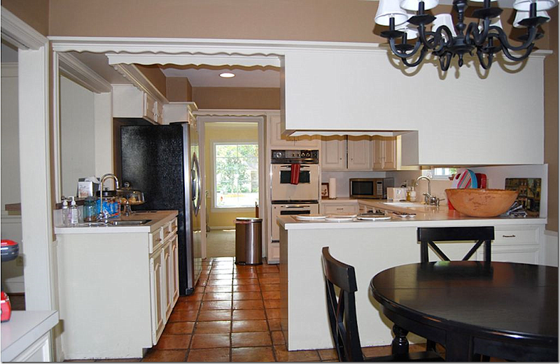
BEFORE: This homeowner wrote me that she was inspired to redo her kitchen after seeing Sally Wheat’s kitchen on my blog. This kitchen was a total gut job, along with the living room, dining room, and family room. To read this homeowner’s story, go HERE.
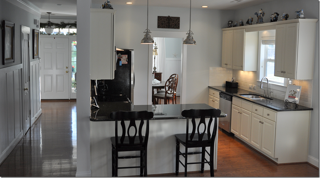
AFTER: What a transformation! This kitchen, inspired by Sally Wheat’s kitchen, in turn inspired reader Corey, another blogger, to redo her own kitchen. What’s interesting is that Corey wasn’t inspired by Sally Wheat’s kitchen, even though Sally’s kitchen inspired this homeowner. Such a tangled web of kitchen redos!
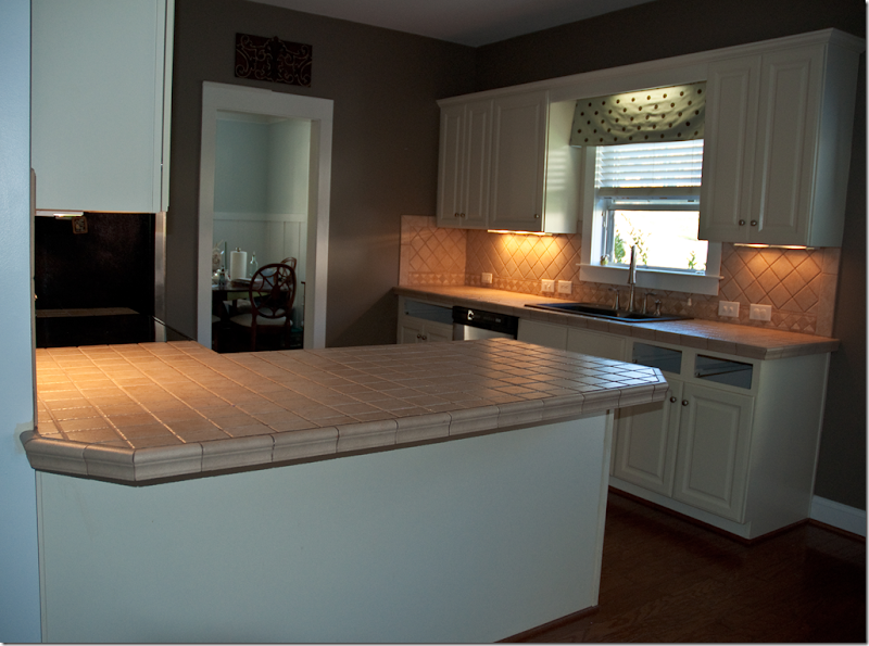
Corey, who writes the blog, And Emma Makes 5, lives in North Carolina with her husband, two sons and her adopted “Russian princess.” She is a part time pharmacist and her husband is a dentist who is currently building his practice. Corey says that while money is not “extremely tight” – she doesn’t like to spend extravagantly. When it came time to change her kitchen after unhappily living with it for seven years, they decided on a small redo, rather than a large one. The major problem was aesthetic – Corey disliked the countertops – which were made out of 4” square tiles. In fact, not only did she dislike the countertops, she hated them! Originally, all Corey was going to do was replace the countertops, but as we all know – one thing leads to another – and she ended up spending around $5,000. to get the kitchen of her dreams. To keep costs down, she did much of the work herself.
BEFORE: Here is Corey’s kitchen with the dreaded 4” square tiled countertop and backsplash. The dark walls and tiles made it all seem so much duller, too.
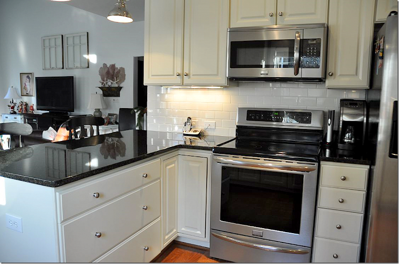
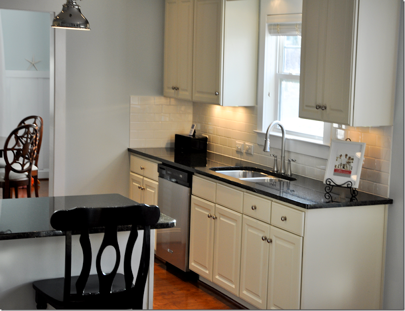
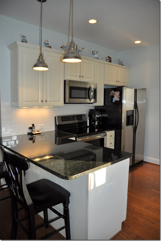
AFTER: What an amazing redo!!!!! Corey bought her Uba Tuba granite from Costco, which was a huge savings. Uba Tuba looks dark enough to appear black and provides a great contrast with white subway tiles. Since the product is economical – they saved a lot of money on the countertops. Corey removed the backsplash herself – another big savings. She also painted the kitchen. The subway tiles came from Lowes Hardware. These 3 x 6 tiles cost only 25 cents each!!! She got the pendant lights at a discount, but truthfully – they look just as nice to me as the more expensive ones. The remodeling was finished just in time for Christmas – so all her decorations are out, including her collection of Santas on top of the cabinets. As far as the appliances – she only had to replace the range and microwave to stainless, which was another cost savings. The dark walls were painted a light blue/gray which make the black and white pop. The paint color is Benjamin Moore Iceberg. The new kitchen is so fresh looking compared to how it looked before. Also notice in the foyer on the left – Corey and her mom recently added the board and batten. It really looks great!
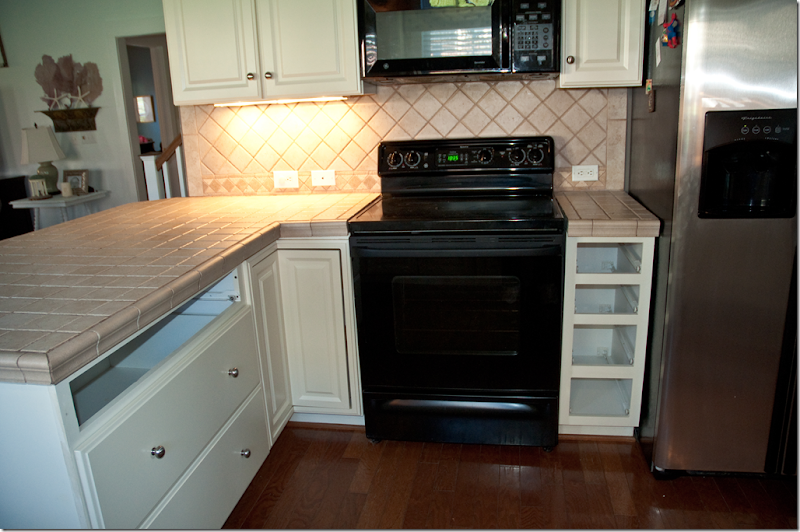
BEFORE: The range and microwave were replaced with stainless.
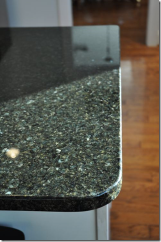
AFTER: Everything just gleams in the redone kitchen! Notice the attractive handles on the range. When choosing appliances, I always try to opt for ones with attractive handles. The Uba Tuba looks wonderful – though it actually is greenish, it comes off looking black. The under cabinet lighting helps to make the kitchen sparkle.
Another view – looking into the family room with this year’s Christmas tree.
The sink is now a inset stainless one. I love the wall color – Benjamin Moore Iceberg – its perfect against the white and black.
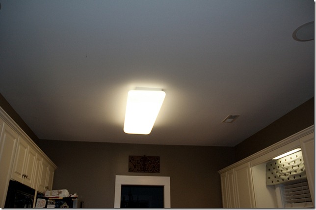
BEFORE: dark walls, fluorescent lighting.
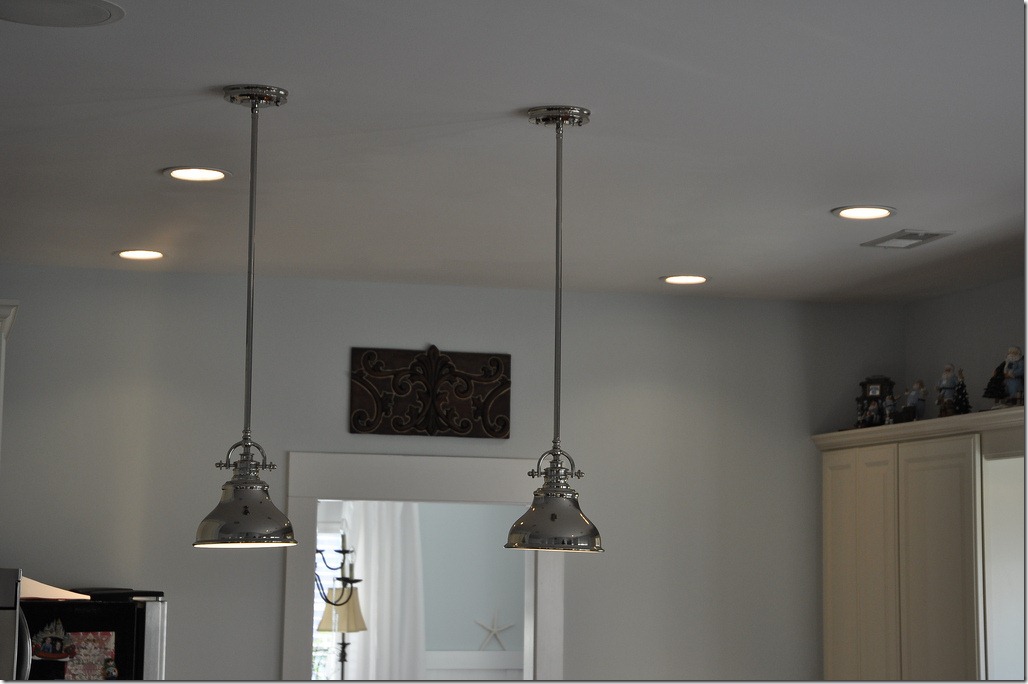
AFTER: Close up of the ceiling without the fluorescent lighting and with the new pendant light fixtures. Corey bought them HERE.
Close up of the Uba Tuba granite.
Corey and her family were lucky to have a White Christmas. Her house is sooo cute!!!! To read Corey’s own account of the kitchen remodeling on her blog, go HERE. Also, if you are interested in international adoption, her blog is a great place to read about her family’s journey and to link with other families who have wonderful stories to share of their own adoptions overseas.
Thank you Corey so much for sharing your story!!!!!
Refrigerator Question:
One question I frequently get asked about is – what to do with refrigerators that aren’t built in. In fact, Corey herself asked me for advice on her refrigerator. I faced this problem in my own kitchen – a lot of people do. One day, Corey could easily make her refrigerator appear built in by replacing the upper cabinet and adding wood around its sides.
This homeowner faced the same problem – the refrigerator looks like it sticks out. Again, the upper cabinet is the culprit.
In my own kitchen, my very inexpensive refrigerator looks sort of built in because the cabinetry above it was built out to cover the top.
A side view of my built in cabinet.
In Inspiration Kitchen #2 – the homeowner did exactly what I did – she built the cabinets out to make it appear built in.
And, in another kitchen renovation that was featured on Cote de Texas, this homeowner used the same trick to make her refrigerator look built in. Read her story HERE.
Eagle Eyed Reader – the best kind:
I’ve written many times of my love of gray painted or Kooboo wicker. I especially love this chair shape. While some stores claim these chairs come from Belgian, I’m not so sure about that. Maybe they do, but copies from Indonesia are available. I can buy chairs like these wholesale, so they are cheaper than finding them at places like Mecox. But still, what if you can’t buy wholesale and spending $500 to $800 on a wicker chair is out of your budget?
Eagle-eyed reader Karen emailed me this ad for these chairs at World Market! WOW $129!!!! Now, granted, these chairs may not be as substantial as the “Belgian” chairs, but still, what a great look for so much less!!! And the two chairs DO look remarkably alike. I wonder. Hmmm. I don’t think you can buy these online though – so count yourself lucky if there is a World Market near you.
OK. I had to laugh at this ad – it says “This ain’t your grandma’s wicker!” Should I scream plagiarism? Back in May when I wrote about the new gray wicker HERE, I called the story – “No More Granny Wicker” – Think World Market read it? hehe. Just send me four chairs and we’ll call it even. I WISH!!!!!
Thanks Karen for sending in the ad!
A huge thank you to all the homeowners and readers, especially Corey, whose kitchens were shown today. If you have a special remodeling story to share, be sure to email me and let me know!!
AND, finally, if you are Lisa Proper, will you please email me?????? Thanks!
Source URL: http://interiordesignblogz.blogspot.com/2011/01/new-kitchen-redo-on-budget_06.html
Visit Interior Design Blogs for Daily Updated Hairstyles Collection
